Most people treat the size filter on a whale feed as a quality dial. Turn it up, get better signals. It is not a quality dial, it is a supply dial, and the Statistics tab shows you exactly how much supply each notch removes before you turn it.
The Bet Size Distribution chart on that tab had four bars at capture. The 100 thousand to 250 thousand bucket held 451 positions, the 250 to 500 thousand bucket held 193, the 500 thousand to 1 million bucket held 94, and the 1 million and above bucket held 25. Those four numbers are the whole article, and the first thing to do with them is add them up.
What 763 positions look like when you slice them
The four buckets total 763. As shares that is 59.1 percent in the smallest bucket, 25.3 percent, 12.3 percent, and 3.3 percent in the largest. Cumulatively, 312 positions sit at 250 thousand or above, 119 sit at 500 thousand or above, and 25 sit at a million or above.
Now look at what each step costs. Going from the 100 thousand floor to the 250 thousand floor removes 59 percent of your rows. The next step removes another 62 percent of what is left. The final step to a million removes 79 percent of what survived that. Each doubling of the threshold cuts supply by at least half, and the last step cuts it by considerably more than half.
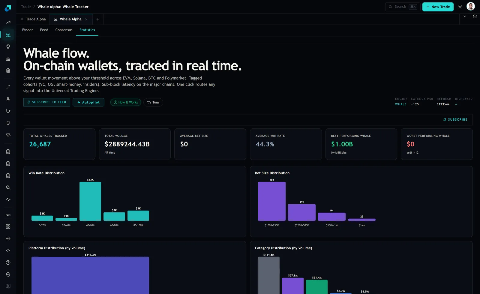
That shape is the ordinary shape for position sizes and it should not surprise you. What is worth noticing is how fast it falls at the top. The ratio between the first bucket and the last is 18 to 1. If you have been running the million dollar filter and wondering why the screen is quiet, this chart is the answer and it has nothing to do with the market being slow.
Turning bucket counts into rows per day
Counts on their own do not tell you what your morning looks like. Combine them with the Feed's daily reading and they do.
At capture the feed showed 12.5 million dollars of tracked whale volume over the previous 24 hours across 50 transactions, from 28 unique wallets. That works out to an average print of 250 thousand dollars, which lands precisely on the boundary between the first and second buckets.
Apply the bucket shares to a day of that size and the arithmetic is unforgiving. If the day's 50 prints distribute like the histogram, then roughly 30 sit in the smallest bucket, 13 in the second, 6 in the third, and between one and two clear a million. One or two rows a day is not a feed. It is an occasional email, and you cannot build a routine on it.
This is why the threshold question is really a question about your own schedule. If you look once a day, a filter that produces one row a day gives you nothing to compare it against, and you will end up taking that row because it is the only one on the screen. A filter producing a dozen rows lets you rank them and decline most, which is the behaviour that actually protects you.
There is a second reason to distrust the thin end, and it comes from the wallet count rather than the position count. Those 50 transactions came from 28 unique wallets, so the typical wallet contributed under two prints. Push the threshold to a million and the handful of positions that survive will belong to a very small number of wallets, possibly to one. At that point your feed is not a sample of whale behaviour, it is a subscription to one participant, and every problem you have with copying a single wallet arrives with it: no independence, no way to tell a view from a hedge, and a stream that goes silent whenever that wallet takes a week off.
The two figures on that page you should ignore
The same screen carries readings that do not survive inspection, and knowing which ones are broken is part of using the page.
The Average Bet Size tile read zero dollars, sitting directly above a histogram of 763 sized positions. A population with 25 positions above a million cannot have an average of zero, so the tile is not computing what its label says. The histogram is the trustworthy object on that screen and the tile is not.
The Total Volume tile has a similar problem, reading a figure in the region of 2.9 million billion dollars all time, which is a formatting failure rather than a quantity. Meanwhile the Win Rate Distribution chart immediately to the left labels its bars in a mix of units, showing 2K, 935, 13K, 3K and 3K across the five win rate bands, so at least one of those labels is not a count of wallets.
None of this makes the bet size chart wrong. It does mean you should treat each panel on the page as a separate instrument with its own reliability, rather than assuming that a number rendered in the same font as another number was produced by the same pipeline.
The floor to set, and the one to combine it with
Here is the decision, and it is one you can make in a minute.
- Start at the 250 thousand floor rather than at 100 thousand or a million. It sits at the day's average print, it keeps 312 of 763 positions in scope, and on a typical day it leaves you roughly 20 rows to sort rather than one.
- Do not stack a size filter with a category filter until you have checked what is left. Size has already removed 59 percent of the population at that first notch. Adding a category on top of it can empty the table completely, and an empty table looks the same whether the market is quiet or your filters are wrong.
- If you want the million dollar rows, treat them as a separate weekly review rather than as your feed. Twenty five positions is a reading list, not a signal stream, and it deserves the attention you would give twenty five things rather than the glance you give a feed.
The last point is the one worth keeping. The histogram counts positions, not wallets and not outcomes, so a bucket with 25 rows in it might be five wallets doing five trades each. Size tells you what a position cost someone. It does not tell you what it was worth, and the tab that shows the size distribution is silent on whether the big bucket did any better than the small one.