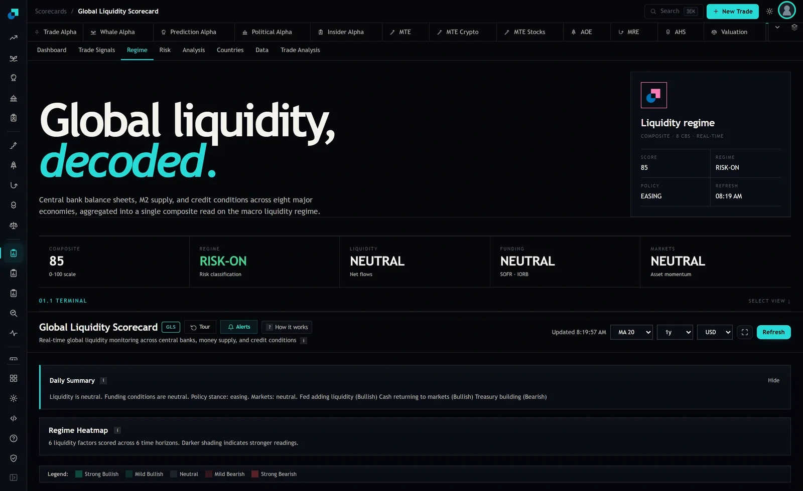
Two words on a dashboard do a lot of unearned work. RISK-ON reads like permission, and most people treat it that way, which is how a macro label ends up sized like a trade idea. The Regime tab on the Global Liquidity Scorecard is showing exactly that label right now, and the interesting thing about the screen is not the label. It is everything sitting underneath it, which is considerably less enthusiastic.
The label is sitting on top of three neutrals
Look at the strip across the top of the tab. Five fields, left to right. COMPOSITE reads 85 on a 0 to 100 scale. REGIME reads RISK-ON, with the small print underneath it saying "Risk classification". Then LIQUIDITY reads NEUTRAL against a sub-label of "Net flows". FUNDING reads NEUTRAL against "SOFR / IORB". MARKETS reads NEUTRAL against "Asset momentum".
So the headline says risk-on and each of the three component reads that follow it says neutral. That is not a contradiction and it is not a bug. It tells you the classification is a statement about something other than a simple vote of the three panels next to it. But it does mean that anybody who reads the second field and stops has read the least informative thing on the page.
The Daily Summary panel lower down says the same thing in sentences: liquidity is neutral, funding conditions are neutral, policy stance is easing, markets are neutral. It then names three drivers with their directions attached, Fed adding liquidity marked bullish, cash returning to markets marked bullish, and Treasury building marked bearish. Two bullish drivers, one bearish, everything else neutral, and a policy stance of easing. That is a considerably more useful sentence than "RISK-ON" and it is one scroll away.
What the classification is a claim about
Here is where I have to be straight with you about the limits of what I can tell you. The tab labels the field "Risk classification" and it does not publish the rule that produces it. I can see the inputs the module says it uses, which are aggregate central bank balance sheets across eight institutions, global M2, USD liquidity indicators and credit spreads. I can see the output. I cannot see the threshold, and I am not going to invent one for you, because a made-up cutoff is exactly the kind of number you would end up sizing a position against.
What I can say with confidence is what category of statement this is. It is a classification of current monetary and credit conditions, derived from the same aggregate that produces the composite. That makes it a description of the environment, in the present tense, on a scale defined by its own history.
That last part matters more than it sounds. A composite of 85 on a 0 to 100 scale is a statement about where conditions sit relative to their own past, not a probability of anything. It does not mean an 85 percent chance. It means conditions are near the top of the range this construction has previously seen. Read it as a percentile-flavoured index and you will read it correctly.
Four things the label does not promise
Direction over the next week is the first. Nothing in a classification of current conditions is a forecast of price, and the module does not present it as one. A risk-on regime that persists for months can contain a nasty drawdown inside it without the label ever changing, because the label is not tracking price.
Price is the second, and it is the biggest hole in every liquidity framework. The composite reads conditions, not valuations. It will happily print 85 while the asset you were about to buy already trades at a level that has discounted every bit of the easing. Liquidity is the tide. It says nothing about what you paid for the boat.
Your portfolio is the third. The classification knows nothing about what you own, what you paid, your time horizon or your ability to hold through a bad quarter. A risk-on read is not an instruction to be more aggressive than your own constraints allow, and the number of people who have talked themselves into extra leverage from two green words is not small.
Durability is the fourth. The label tells you the current state. It carries no claim about how long that state has lasted so far or how long it will continue, and the tab does not publish a duration figure. If you want to know whether this regime is two weeks old or seven months old, you have to have been logging it.
The heatmap is where the label gets its texture
The panel worth your attention on this tab is the Regime Heatmap, which the module describes as six liquidity factors scored across six time horizons, with darker shading indicating stronger readings. The legend runs across five levels: strong bullish, mild bullish, neutral, mild bearish, strong bearish.
That construction is doing something the single label cannot. By scoring the same factors over multiple horizons at once, it exposes whether a reading is a short-run wobble or something that holds across timeframes. A factor that is strong bullish at the long horizons and mild bearish at the short ones is a different situation from one that is bearish everywhere, and the two would compress into the same summary word.
Practically, this is how I would use the tab in ninety seconds a week. Note the composite and the regime label. Then look at whether the heatmap is coherent across horizons or split. A coherent grid supports acting on the label. A split grid, with the short horizons disagreeing with the long ones, is the module telling you the regime is contested, and contested regimes are where overlays lose money by trading every wobble.
Using a label that is not a forecast
The way to make a regime classification useful is to attach it to sizing rather than to entries, and to write the mapping down before you need it.
Mine is deliberately crude. A risk-on classification with a coherent heatmap and confirming component reads means I hold my full intended risk allocation. A risk-on classification sitting on three neutral component reads, which is exactly this screen, means I hold my normal allocation and do not add. A risk-off classification means I am at reduced allocation with no new entries until it changes. Three states, three numbers, chosen by me based on what I can hold through a bad month.
Then log it. One line a week: date, composite, regime label, policy label, the three component reads, the refresh stamp. Six months of that and you own something the dashboard cannot give you, which is a record of what you actually saw at the time, before any of the underlying series were revised. It is also the only way you will ever answer the question that matters, which is whether following this label changed your outcomes or just changed how confident you felt while getting the same result.