Holder count is the column people quote at each other when they want a new token to sound real. Four thousand holders in a day sounds like discovery. It is also something you can produce with one script, a few dollars of gas on a cheap chain, and about ten minutes, which is why I stopped reading the number as a number.
The launch tracker scores every fresh token on holders, liquidity, market cap and safety flags. Holders is the softest of those four, and it is soft in a specific way that has a fix. A level is cheap. A rate is not, because a rate has to be sustained across time and every hour of sustaining it costs the person doing it more money.
Why the level is the wrong reading
A holder count is the number of addresses with a non-zero balance. Nothing in that definition requires any of those addresses to have paid for anything. A batch distribution to a list of addresses produces a large holder count with no buying pressure and no capital at risk, and on chains where the transfer cost is trivial the whole exercise is cheaper than a decent lunch.
So when you see a large holder number on a token that is hours old, the first question is not whether it is impressive. It is whether those addresses arrived by buying or by receiving. The count itself cannot tell you, and neither can any single reading of it.
The number is also unbounded on the wrong side. Nothing stops a holder count from being large and the float from being concentrated at the same time. Ten thousand addresses holding dust while three wallets hold most of the supply is a perfectly ordinary configuration that reads as broad distribution in the column.
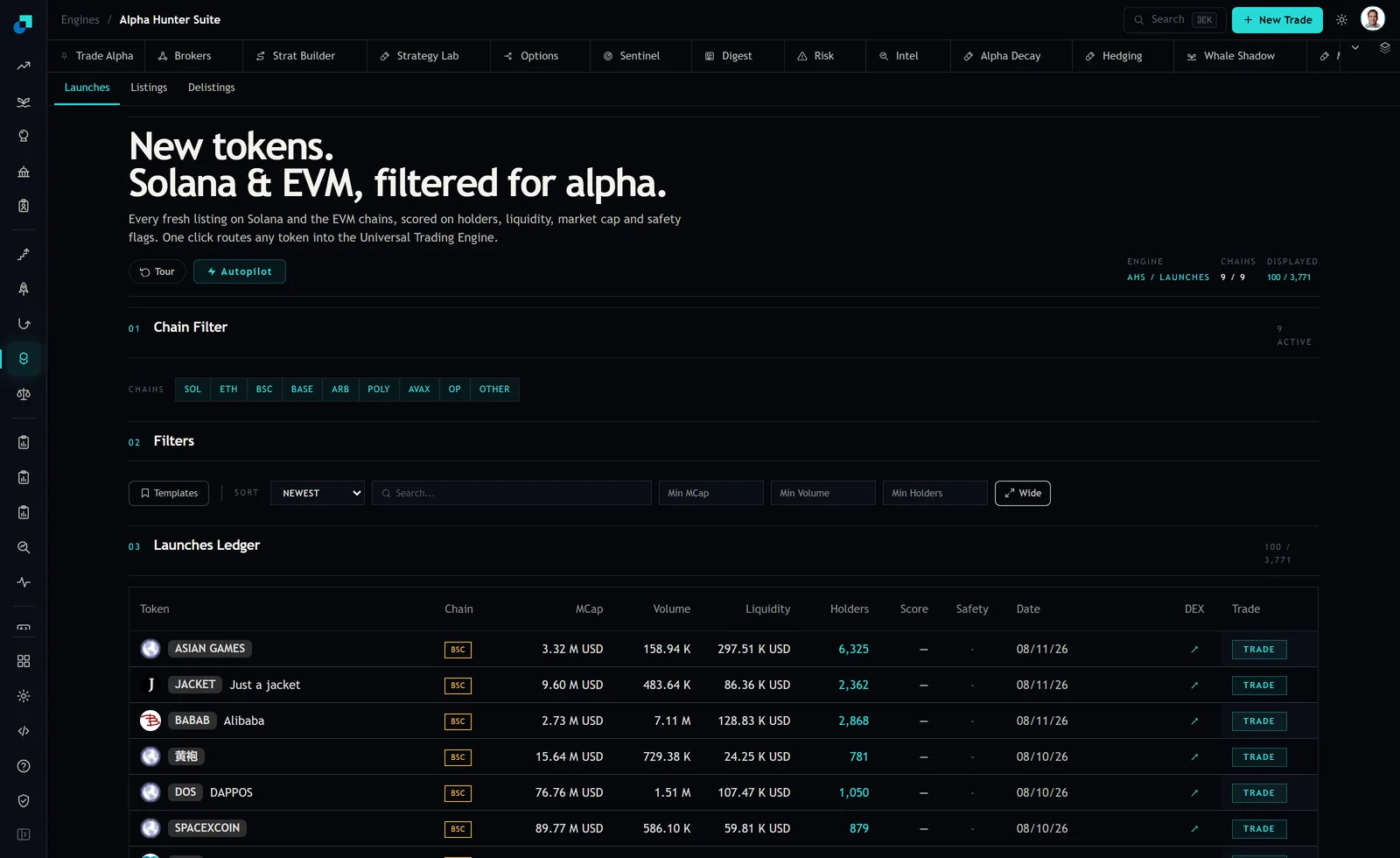
The screenshot is a single moment. That is the whole issue and also the whole solution. The ledger refreshes, and the rows you were looking at are still there with updated figures, so the second reading costs you nothing but the discipline of writing the first one down.
Sampling the same rows twice
The method is unglamorous. Filter down to a shortlist you actually care about, note the holder figure and the timestamp against each symbol, and do it again later in the session. Two readings an hour or two apart is enough to be informative. Three is better.
Two details make the difference between a useful sample and a misleading one. First, keep the filters identical between readings. If the second run has a different liquidity floor, you are comparing different populations and any change you see is your own doing. This is the practical argument for saving the screen rather than rebuilding it.
Second, record the liquidity figure alongside the holder figure at each reading. Holder growth on its own is ambiguous. Holder growth with pool depth rising alongside it is a different event from holder growth with pool depth falling, and you cannot reconstruct which one happened if you only wrote down one of the two columns.
Express the result as holders added per hour rather than as a percentage. Percentages on small bases are noise. A token going from forty to eighty holders is a hundred percent increase and means almost nothing, while a token adding four hundred an hour for three hours running is doing something whatever its starting point was.
The four shapes and what each one implies
Across two or three samples you get one of four shapes, and each one points at a different mechanism.
- A step. The count jumps between two readings and then goes flat. That is the signature of a batch event, an airdrop or a distribution from one source, rather than a stream of independent buyers. It is not automatically bad, plenty of legitimate projects distribute this way, but it should not be read as demand.
- A smooth climb. Holders rise steadily across every sample. This is what organic accumulation looks like, and it is the shape that is genuinely expensive to fake because each new address costs somebody something and the cost keeps recurring.
- Flat with the price moving. The holder number does not budge while the chart does. Whatever is moving the price is happening between existing holders, or between an existing holder and the pool, and the token has not found new participants. This is the shape I am most cautious about, because the price is doing the thing that attracts attention while the distribution is doing nothing.
- Rising holders with falling liquidity. Addresses are increasing while pool depth is decreasing. Somebody is distributing tokens outward while removing paired asset. Of the four this is the one that makes me close the tab, not because of any statistic about outcomes but because the two halves of it point in opposite directions and only one of them is money.
I want to be careful about how much weight these carry. These are readings of a mechanism, not a scoring system with a track record. Shape two is the one I want to see and shape four is the one I avoid, and both of those are statements about what the underlying transactions must have been rather than predictions about the price.
Where the derivative lies to you as well
Sampling fixes the cheapest problem with the holder column. It does not fix all of them, and it introduces one of its own.
The obvious one is that a smooth climb can be manufactured too. It costs more than a batch transfer, because it has to be spread over time and across enough addresses to look plausible, but it is not hard, and on a low-fee chain it is not even expensive. What the rate buys you is a higher price on the deception, not immunity from it. Combined with liquidity that is also rising, it becomes meaningfully harder to fake, because pool depth is capital that has to actually sit there.
The subtler problem is your own sampling interval. Two readings taken an hour apart on a token that launched forty minutes ago are measuring the initial distribution, which is always fast and always looks like growth. The rate only becomes interpretable once the token is past whatever its opening burst was, and if you sample too early you will read every launch as accelerating.
There is also a ceiling effect that has nothing to do with quality. A token that has already found its natural audience stops adding holders quickly, and the flat reading you get is not the same flat reading as a token that never found one. Age is the thing that separates those two, which is why the age band on your screen matters as much as the holder floor.
Making it a decision rather than an observation
The version of this I actually use is a short rule and it fits in one line. I want two consecutive readings showing holders up and liquidity flat or up, on a token inside my age band, before I do any further work on it. Everything that fails that test gets dropped, and the rule is applied before I look at the chart rather than after, because looking at the chart first will make me generous with the interpretation.
What that buys is not a better hit rate that I can quote you. It is a shortlist where every name got there by demonstrating something across time rather than by presenting a number at a moment, and that is a materially different list from the one you get by sorting the holders column and reading down.