Somewhere in the operational due diligence pack there is a single page headed execution quality, and it is usually the weakest page in the document. It is weak in a specific and recognisable way: it reports how well the strategy did rather than how well the strategy was implemented, and an allocator who has read a hundred of these will spot the substitution in about four seconds.
Four exhibits carry that page. Shortfall by size bucket, venue mix, reject rate, and a log of outliers with written explanations. What follows is where each one is actually sourced when your signals come off a platform feed and your fills come off a broker, and the honest answer in every case is that the exhibit is a join and the feed owns one side of it.
The counters that must not appear on this page
Start with the exclusion, because it is the most common failure and the easiest to fix.
The Trade Alpha header carries a set of summary counters. At capture they read active trades 2, today's trades 0, average win rate 96.6 percent across all sources, and best source MRE, labelled as highest thirty-day performance. Every one of those is a statement about signal quality. None of them is a statement about execution quality, and a win rate on the execution page is the tell that the author did not understand the question.
The distinction an allocator is testing is whether you can separate the decision from the implementation. Signal performance answers whether the ideas were good. Execution quality answers what fraction of the idea survived the trip to the market, and whether that fraction is stable, and whether it degrades with size. A fund that cannot answer the second question separately from the first cannot tell an allocator what happens when the allocation doubles the size of the book, which is the only reason the allocator is asking.
Exhibit one, shortfall against a stated arrival price
Implementation shortfall needs two prices and a size. The decision price, the achieved price, and the quantity that moved. The feed gives you exactly one of the three, and it gives it to you cleanly.
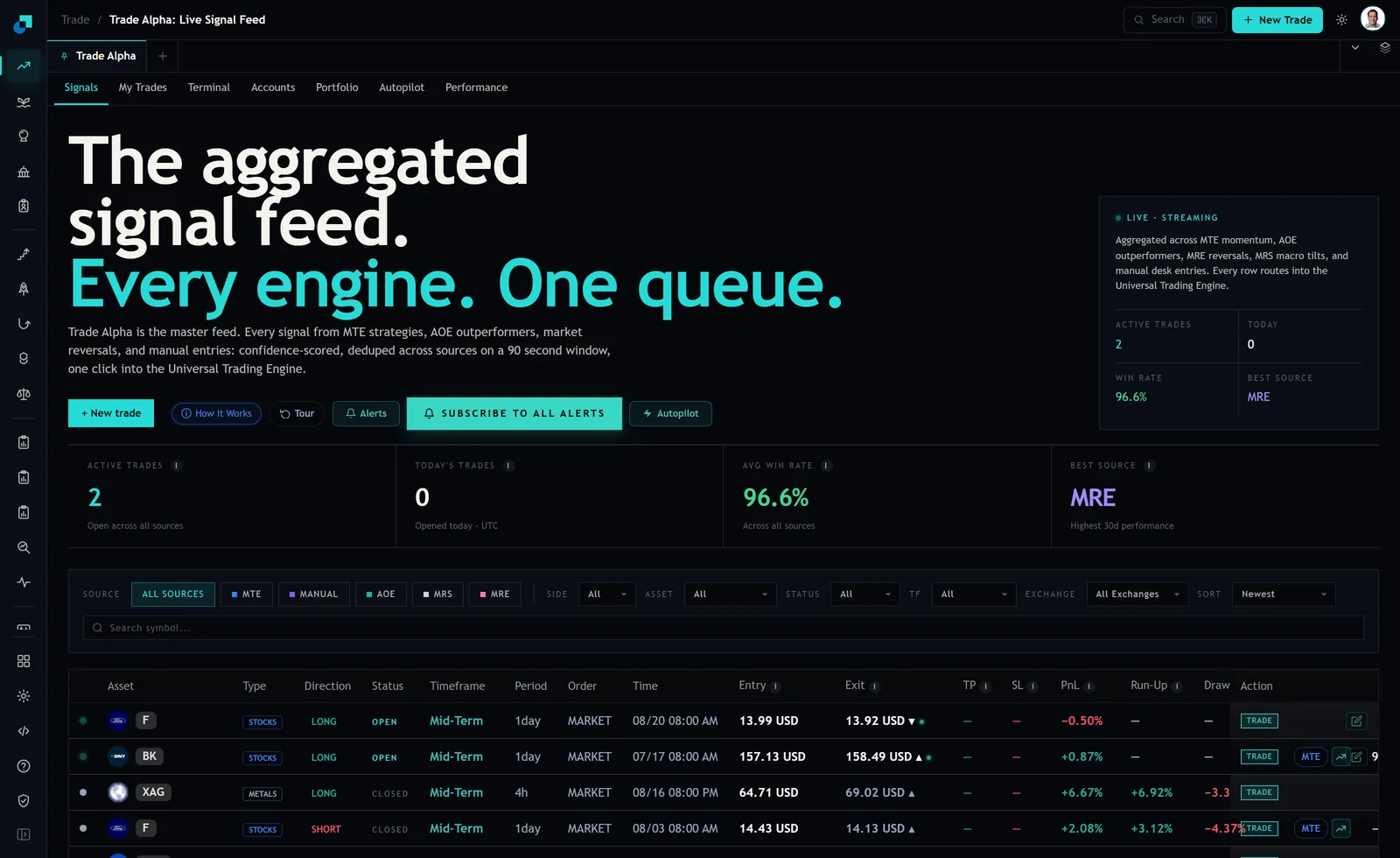
The row carries an Order type, a Time, and an Entry price. On the rows visible at capture the order type read MARKET throughout, with entries such as 13.99 USD against a signal time of 08/20 08:00 AM and 64.71 USD against 08/16 08:00 PM. That pairing of a timestamp with a price at that timestamp is your arrival anchor, and it is a better anchor than most desks manage, because it is recorded by a system that has no stake in how the fill turned out.
What the feed does not carry is your size. There is no notional or quantity column, and there should not be, since the feed is one signal serving many books at many sizes. So the exhibit is built by joining feed rows to your own fill records on instrument and time, computing shortfall against the feed's entry price, and bucketing by the notional that only your side knows.
Two rules keep that exhibit honest. Define the arrival price once, in writing, and never switch anchors between periods. And bucket by size in absolute notional and as a fraction of the instrument's typical traded volume, because a hundred thousand dollars is a small order in one name and the entire day in another, and an allocator sizing a mandate cares only about the second measure.
Exhibit two, venue mix and the account grouping behind it
Venue mix answers a crowding and concentration question. If ninety percent of the flow lands at one venue, the allocator is entitled to ask what the book looks like on the day that venue is unavailable, and the answer had better not be improvised.
The platform gives you two useful handles here. The signals feed carries an Exchange filter alongside source, side, asset, status and timeframe, so the feed itself can be sliced by venue. The performance view groups by account rather than by venue, and at capture offered all accounts cumulative alongside named groupings that showed trade counts against them, with Alpaca at 16 and a secondary account at 11, over selectable windows from one day to one year.
Account groupings are the right unit for the exhibit even though venue is what you report, because the account is what your credentials and your legal relationship attach to. Report the mix by account, name the venue behind each account, and state the share of notional rather than the share of trade count. Trade count mix flatters a book with many small trades at one venue and a few very large ones at another, and the concentration that matters is always in the notional.
Exhibit three, the reject rate you cannot source from the feed
This is where I have to be direct, because the temptation to fudge it is real.
The reject rate is not in these records. The status field on the feed distinguishes trade states, and the rows at capture read OPEN and CLOSED. Those are lifecycle states of a position. A reject is an event in the order lifecycle that happens before a position exists, and a feed of signals and resulting positions has no reason to carry it and does not.
So the exhibit comes from your broker or your order management layer, and it comes as counts of orders sent, orders accepted, orders rejected, and rejects by reason code. Present it that way, name the source system explicitly on the page, and resist the very natural urge to compute a reject rate as signals received divided by positions opened. That ratio is not a reject rate. It is a mixture of your own filtering decisions, your risk limits, your capacity constraints and actual venue rejects, and presenting it as an execution metric is the kind of thing that turns a routine review into a longer review.
If you genuinely cannot source rejects yet, write that on the page along with the date you will be able to. An allocator will accept a gap that is disclosed. What they will not accept is a number whose provenance falls apart when they ask one question about it.
Exhibit four, the outlier log
The outlier log is four or five rows and it is the exhibit that actually gets read, because it is the only one where a human wrote a sentence.
Screen for candidates using the fields the feed already gives you. Run-Up and Draw sit next to PnL on every row and describe the path rather than the endpoint, and a row whose realised outcome sits far from what the path suggested was available is worth a look regardless of whether the outcome was good. At capture one metals row showed a PnL of 6.67 percent against a run-up of 6.92 percent and a drawdown figure alongside it. That gap is small. The rows where it is not small are your candidates.
For each entry log the instrument, the date, the notional, the shortfall, the venue, a one-sentence cause, and what changed as a result. Include at least one entry where the answer to the last field is that nothing changed, because sometimes the correct response to an outlier is to accept it, and a log in which every incident produced a process change reads as invented rather than lived.
The join key, and what to write when there is not one
All four exhibits stand on the same foundation, which is the ability to say that this fill corresponds to that signal. Get that wrong and the rest of the page is arithmetic performed on a guess.
The feed helps more than it might appear. Rows are described as deduplicated across sources on a ninety second window, which means the same underlying idea arriving from two engines does not present as two signals to be matched separately. That removes a whole class of double-counting from the join before you start.
Match on instrument, side and time proximity, and write down the tolerance window you used. Then report the match rate on the page itself. A stated match rate of ninety four percent with a described residual is a document that survives scrutiny. A page that quietly reports metrics on the matched subset and never mentions that a subset exists is a page that only survives until someone asks how many rows went in.