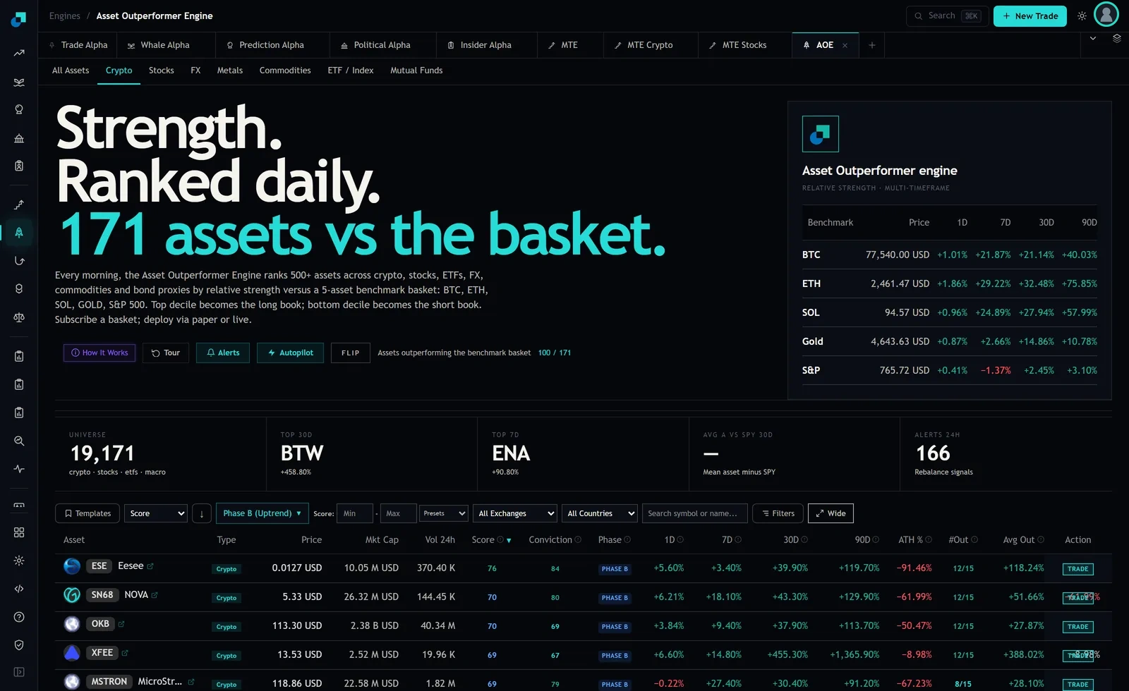
The Asset Outperformer board carries two fields that both describe how an asset did against the benchmark basket, and they are placed next to each other at the right-hand end of the row. The board labels them #Out and Avg Out. The first is a count, rendered as a fraction of fifteen. The second is a percentage. Reading them as two views of the same thing is the mistake, because they are different estimators of different properties and they routinely disagree.
Here are the top five crypto rows at capture, taking only those two fields. Eesee, 12 of 15, plus 118.24 percent. NOVA, 12 of 15, plus 51.66 percent. OKB, 12 of 15, plus 27.87 percent. XFee, 12 of 15, plus 388.02 percent. The tokenized MicroStrategy wrapper, 8 of 15, plus 28.10 percent. Four of the five are identical on the count and span a fourteenfold range on the magnitude.
Two estimators, one row
The count answers a question about breadth. Fifteen is five benchmarks, Bitcoin, Ethereum, Solana, gold and the S&P 500, evaluated across three lookbacks, and the cell says how many of those individual contests the asset won. It is a hit rate expressed in whole numbers. It carries no information about margin, so a win by four basis points and a win by four hundred percent contribute equally.
The average answers a question about magnitude. It is a mean of the outperformance across those same comparisons, so it is dominated by whichever window contained the largest move, and it is scale free in a way the count is not. It carries no information about consistency, so a single enormous win against fourteen small losses can still print a healthy positive number.
Neither is wrong. They are the two moments of the same distribution and you need both to describe an asset, which is precisely why a sleeve that ranks on one of them is silently discarding the other.
The count ties, and ties are not a small problem
A field with sixteen possible values, zero through fifteen, cannot order a large universe. The crypto tab at capture ranked 171 assets and the stocks tab ranked 522. Push either through a sixteen bucket estimator and the modal bucket holds a large fraction of the board. The four way tie visible in the top five rows is not a coincidence of that particular screen, it is the arithmetic working as designed.
For a desk this matters at the decile boundary and nowhere else, but the decile boundary is where all the money is. If your sleeve funds the top ten percent of a 522 name board, you are cutting at name fifty two, and if names forty through eighty all carry the same count, then the cut is being made by whatever the tiebreak happens to be. In most implementations nobody has specified the tiebreak, so it is the sort stability of the underlying extract, which is to say it is arbitrary and it changes between refreshes for no economic reason.
That produces turnover with no expected return attached to it. Before you sort on the count, work out how many names sit in the bucket that straddles your cut line and decide explicitly what breaks the tie. Avg Out is the obvious candidate and it is defensible. Market cap is defensible. A coin flip is not.
The average is a tail statistic wearing a mean's clothing
Run the same scepticism at the other column. XFee showed plus 388.02 percent average outperformance, and on the same row the ninety day return reads plus 1,365.90 percent against a thirty day of plus 455.30 percent. A mean computed across comparisons that include a move of that size is not a summary of the asset's typical behaviour. It is a restatement of one window.
Compare that with OKB on the same board, 12 of 15 and plus 27.87 percent, sitting on a 2.38 billion dollar market cap and 40.34 million dollars of daily turnover. The two names have identical breadth. On magnitude, one of them is describing a microcap that went up fifteen times on a twenty thousand dollar tape, and the other is describing a large liquid asset that beat the basket steadily. Sorting descending on Avg Out puts the first one at the top of your book. Sorting on the count puts them level.
The failure mode for a magnitude sort is therefore predictable: it selects for tail events, which in a cross section of crypto means it selects for the smallest and least liquid names, which means the sleeve's capacity is being set by the ranking metric rather than by policy. That is a bad place to have that decision made.
What the sleeve should sort on, given what it has promised
The choice follows from the sleeve's mandate rather than from which field looks better in a backtest.
A risk-controlled sleeve with a tight drawdown tolerance should sort on breadth and use magnitude as a filter, not the reverse. The count is the more stable estimator across refreshes precisely because it is coarse, and stability is what keeps turnover down and keeps positions inside their risk budget between rebalances. Screen out the bottom of the magnitude distribution to avoid funding names that won fifteen trivial contests, then rank the survivors on the count, then break ties on magnitude. You give up the tails deliberately, which is the trade a drawdown mandate has already agreed to.
A sleeve with a wide drawdown tolerance and a genuinely long horizon has a better case for the magnitude field, because it is being paid for the tails and has the risk budget to hold them through the interim. Even there, cap position size by liquidity rather than by rank, or the metric will hand you a book of microcaps.
Rebalance frequency cuts across both. The count is built over lookbacks that include the longest window on the board, so consecutive readings are heavily overlapping and the field moves slowly. Rebalancing weekly against a slow field is mostly paying costs to re-express the same view. Magnitude moves faster and refreshes carry more genuinely new information, so it tolerates a shorter cycle. Match the cadence to the estimator, and if the two are mismatched the symptom shows up as turnover that has no attribution.
Four scalars on one board, and only one factor definition
The wider governance point is that the row already carries more ranking scalars than a factor definition can accommodate. Score and Conviction both sit to the left of Phase, and at capture they disagreed openly: Eesee showed 76 and 84, the tokenized MicroStrategy row 69 and 79, OKB 70 and 69. Add #Out and Avg Out and there are four numbers on a single row that could each order the universe, plus a set of per-period returns that could order it a fifth way.
Every one of those headers carries an information affordance, and the first task before any of this becomes process is to open each one and write down what the field is defined as, in your own document, in your own words. The second is to check what the sort selector on the toolbar actually offers, because a sleeve designed to rank on a field that turns out not to be sortable in the interface becomes a manual extract job, and manual extract jobs are where reproducibility goes to die. Pick one field, state why, and record the date you picked it, so that when the sleeve is reviewed the question is whether the choice was right rather than whether a choice was ever made.