Risk buckets in most books are inherited rather than measured. Equities get GICS sectors, credit gets ratings bands, crypto gets an informal split into majors and everything else. Those schemes are accounting conventions built for reporting comparability, and none of them was designed to answer the question a risk report is actually asking, which is which of these positions move together.
Hierarchical clustering on correlation distance answers that question directly. It takes the matrix you already have, converts every coefficient into a distance, and builds a tree whose branches are defined by measured co-movement. The buckets that fall out are frequently not the buckets on the fact sheet, and the disagreements are the interesting part.
Turning a coefficient into a distance
A correlation is not a distance. It runs the wrong way, with high values meaning close together, and it fails the triangle inequality, so a clustering algorithm cannot use it directly. The standard conversion is the square root of two times one minus the coefficient, which produces a proper metric.
The scale is worth memorising because you will read dendrogram heights all day. A correlation of 1.0 maps to distance 0. A correlation of 0.88 maps to 0.49. A correlation of 0.80 maps to 0.63. A correlation of zero maps to 1.41, and perfect negative correlation maps to 2. Note what that last point implies. This metric treats a strongly negatively correlated pair as the furthest thing apart, which is right for a diversification question and wrong if you are hunting for hedges, where you want the absolute value instead.
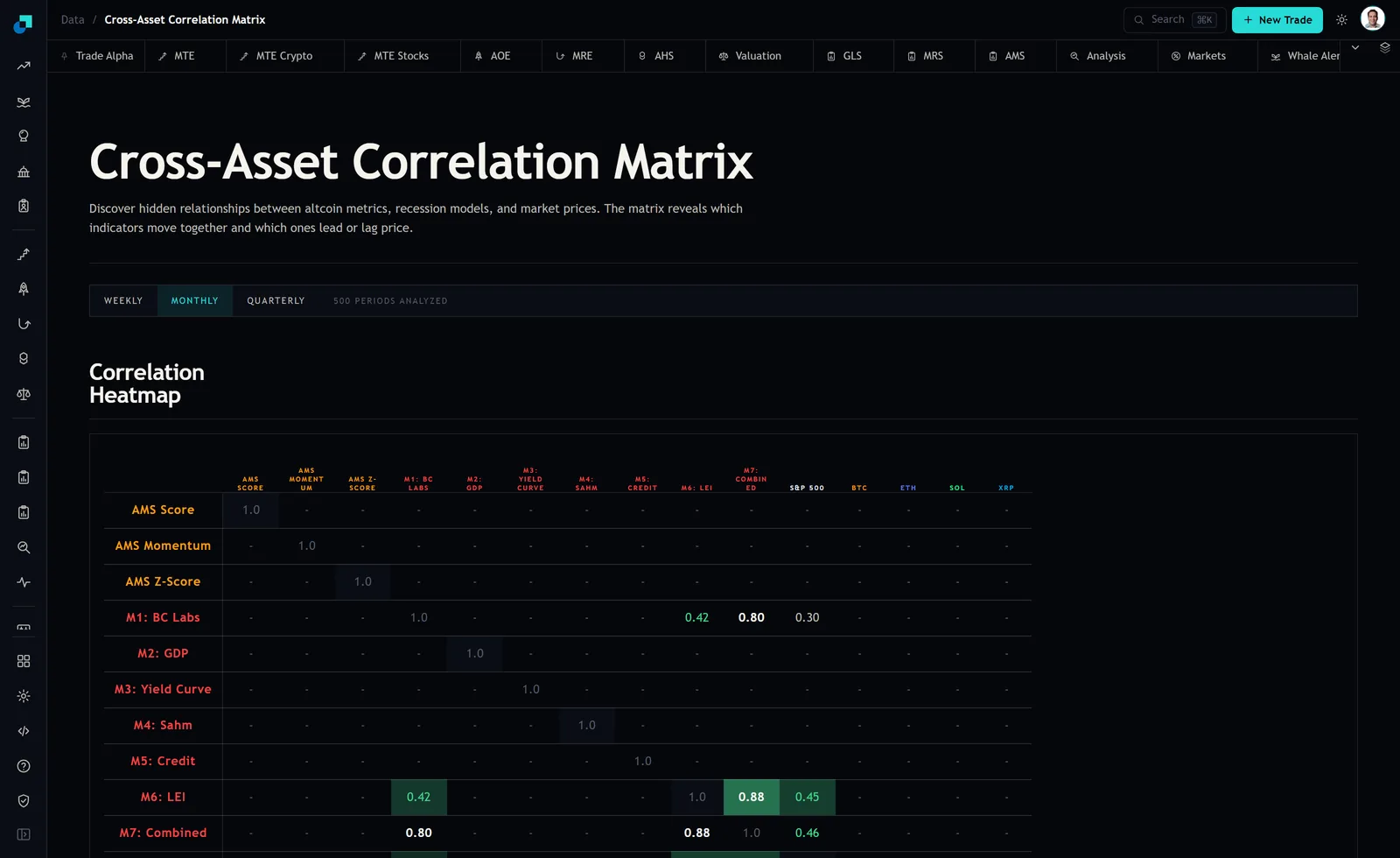
Four series, three merges, one tree
At the time of writing the panel was on its MONTHLY window over 500 periods analyzed, and four rows carried readings against each other. M1 (BC Labs), M6 (LEI), M7 (Combined) and the S&P 500. The six coefficients were 0.88 for M6 against M7, 0.80 for M1 against M7, 0.46 for M7 against the S&P, 0.45 for M6 against the S&P, 0.42 for M1 against M6 and 0.30 for M1 against the S&P.
Converted to distances that becomes 0.490, 0.633, 1.039, 1.049, 1.077 and 1.183. Run average linkage. The first merge is the closest pair, M6 with M7 at height 0.490. The distance from that new cluster to M1 is the average of 1.077 and 0.633, which is 0.855, and the distance to the S&P is the average of 1.049 and 1.039, which is 1.044. The smaller of those wins, so M1 joins at 0.855. The S&P joins the whole group last, at 1.090.
The tree says something a sector scheme cannot. M6 and M7 are effectively one node. M1 is adjacent to them. The S&P 500 sits outside, which is the useful part, because an equity index and a set of recession models are different objects in the label scheme and the tree agrees for a measured reason rather than a definitional one.
Where to cut, and what the height means in correlation terms
A dendrogram is not a bucketing until you cut it, and the cut height is the only real judgement call in the procedure. Do not pick it by eye. Convert it back into correlation, because that is the number your policy is really expressing.
Invert the metric and a cut at height h corresponds to an average within-bucket correlation of one minus h squared over two. A cut at 1.0 means buckets whose members average 0.50 or higher. A cut at 0.855 means 0.63 or higher. A cut at 0.63 means 0.80 or higher. State the policy that way in the risk document, as a correlation floor rather than a tree height, and the number becomes reviewable by someone who has never seen a dendrogram.
On the four series above, a cut at 1.0 produces two buckets, the three recession models together and the S&P alone. A cut at 0.75 produces three, splitting M1 out from the M6 and M7 pair. Neither is correct in the abstract. The 0.50 floor is the one I would defend to a committee, because a pair correlated at 0.5 that you are treating as two independent exposures will not behave like two in a drawdown.
Linkage choice changes the answer, so it is not a default
Most implementations default to a linkage rule and most users never revisit it. On this data that would have cost you the finding. Single and average linkage agree on the topology above, attaching M1 to the M6 and M7 cluster before the S&P joins. Complete linkage produces a different tree entirely, merging the S&P into the cluster at height 1.049 and leaving M1 as the outlier until 1.183.
Four series, six coefficients, and two of the three standard linkage rules disagree about which one is the odd one out. That is not a bug in either rule. Single linkage chains on the nearest member and will happily string together a long thin cluster through a series of near neighbours. Complete linkage requires every member to be close to every other and tends to produce compact, conservative buckets. Average linkage sits between them.
For risk bucketing I use average or complete and never single, because chaining is exactly the failure you cannot afford. A bucket assembled by chaining can contain two members with almost no relationship, joined through intermediaries, and the concentration limit you write against that bucket will be measuring something incoherent. When average and complete disagree, as they do here, that disagreement is itself the reportable result. It means the structure is not stable enough to carry a hard limit yet.
Buckets no label scheme would have produced
The reason to do any of this is that measured buckets catch crowding that label buckets hide. Two positions in different sectors, in different currencies, at different points of the capital structure, can be one factor bet with two names on it. A GICS-based exposure report will show them as diversified, honestly and correctly, according to a classification that was never asked about co-movement.
Three practical constraints before this goes into production. Coverage first, because clustering needs a complete sub-matrix and at capture only six of the 105 unique pairs on this fifteen-row grid carried a coefficient at all. You cluster what you can measure and you name what you excluded. Second, stability, because a tree built on the weekly toggle and a tree built on the quarterly toggle are two different opinions and you should look at both before committing to either. Third, rebalancing frequency, since re-clustering every week produces buckets that churn and limits that mean nothing. Quarterly re-fitting with an interim review trigger is the rhythm that has held up for me.
Keep the label-based report as well. Not because it is better, but because it is the one the client, the auditor and the fact sheet all speak, and being able to show both reports side by side with the disagreements circled is worth considerably more than replacing one with the other.