
Blockcircle Global Liquidity Scorecard (GLS) – User Guide
COMPLETE SETUP & CONFIGURATION MANUAL
PREREQUISITES & INITIAL SETUP
Before beginning, ensure you have:
- A TradingView account (minimum Essential, preferably Plus+)
- Active Blockcircle subscription
Account Integration Process
- TradingView Account Creation -> Navigate to TradingView.com and create your account. Choose a username carefully, as this will be permanent and case-sensitive. Write down your exact username, including any numbers, underscores, or capital letters. For example, if you register as “Blockcircle_Trader1234”, this exact format must be used everywhere.
- Blockcircle Integration Visit blockcircle.com/account and enter your TradingView username exactly as registered. The system performs case-sensitive matching – “Blockcircle_Trader1234” will not match “blockcircle_trader1234”. After entering your username, you’ll receive access to the Blockcircle AMS – Altcoin Market Scorecard.
- Accessing Your Trading Chart -> Once logged into TradingView, click “Chart” in the top navigation menu. You’ll see a default chart appear. To change the trading pair, click the symbol in the top-left corner (usually showing “AAPL” or another default). Type your desired pair, such as “BTCUSDT,” and select the appropriate exchange (BINANCE, COINBASE, KRAKEN, etc.).
- Timeframe Selection Above the chart, you’ll see timeframe options (1m, 5m, 15m, 1h, 4h, D, W, M).
- Adding Blockcircle GLS – Global Liquidity Scorecard to Your Chart -> Click the “Indicators” button (looks like ƒx) at the top of your chart. In the search window that appears, navigate to the “Invite-Only” tab. You should see “Blockcircle GLS – Global Liquidity Scorecard” if your account has been granted access. Click on it once to add it to your chart.
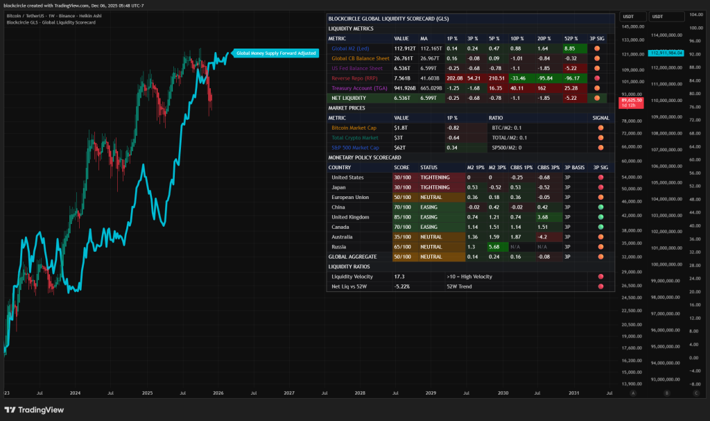
The Blockcircle Global Liquidity Scorecard (GLS) is a professional-grade market intelligence tool that monitors the most important driver of asset prices: global liquidity.
This guide will teach you how to interpret each metric, understand its significance, and use the data to make informed investment decisions.
Core Philosophy: All asset prices are ultimately driven by the supply of money in the financial system. When central banks inject liquidity, asset prices tend to rise. When liquidity contracts, asset prices tend to fall. The GLS puts this critical information at your fingertips in real-time.
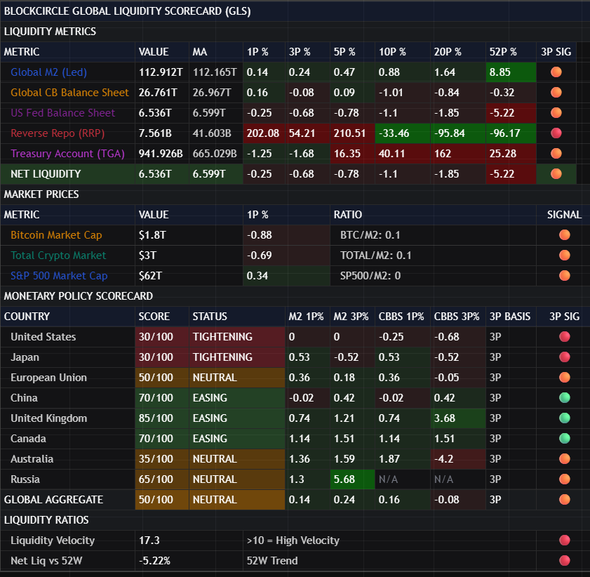
SECTION 1: LIQUIDITY METRICS
This is the heart of the GLS. It tracks the most important liquidity indicators that professional traders and institutions monitor daily.
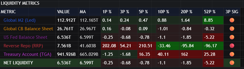
Global M2 (Led)
What It Is: Global M2 represents the total money supply across the world’s major economies, converted to US dollars. It includes cash, checking deposits, savings deposits, money market securities, and other near-money assets. The “(Led)” designation indicates this metric is displayed with a forward projection on the chart.
Why It Matters: Global M2 is the broadest measure of money available in the financial system. When M2 expands, there is more money chasing assets, which typically drives prices higher. When M2 contracts, there is less money in the system, which puts downward pressure on prices.
How to Use It:
- Watch the trend: Consistent expansion over multiple periods suggests a favorable environment for risk assets
- Compare to assets: When M2 grows faster than asset prices, assets may be undervalued relative to money supply
- Monitor the rate of change: Accelerating M2 growth is bullish; decelerating growth signals caution
Key Columns:
- VALUE: The current total global M2 in trillions of dollars
- MA: The moving average, showing the smoothed trend
- 1P% through 52P%: Percentage changes over 1, 3, 5, 10, 20, and 52 periods (weeks on weekly chart)
- 3P SIG: A visual signal based on the 3-period change direction
What to Look For:
- Green background in percentage columns indicates expansion
- Red background indicates contraction
- The 3P SIG provides a quick visual indicator of the short-term trend
- Compare short-term changes (1P, 3P) to longer-term changes (20P, 52P) to identify trend shifts
Global CB Balance Sheet
What It Is: This metric aggregates the total assets held by the world’s major central banks, including the Federal Reserve, European Central Bank, Bank of Japan, People’s Bank of China, Bank of England, Bank of Canada, Reserve Bank of Australia, and Reserve Bank of India.
Why It Matters: Central bank balance sheets directly reflect monetary policy actions. When central banks expand their balance sheets through quantitative easing (QE) or other asset purchase programs, they inject liquidity into the financial system. When they contract through quantitative tightening (QT), they remove liquidity.
How to Use It:
- Expansion signals accommodation: Rising balance sheets indicate central banks are actively supporting markets
- Contraction signals tightening: Falling balance sheets indicate central banks are removing support
- Global coordination matters: When multiple central banks expand simultaneously, the effect is amplified
What to Look For:
- Sustained expansion across multiple periods is strongly bullish for risk assets
- Contraction, especially when accelerating, suggests defensive positioning may be warranted
- Compare the global aggregate to individual country scores in the Monetary Policy Scorecard section
US Fed Balance Sheet
What It Is: The total assets held by the United States Federal Reserve, the world’s most influential central bank. This includes Treasury securities, mortgage-backed securities, and other assets the Fed holds.
Why It Matters: The Federal Reserve’s actions have an outsized impact on global financial markets due to the US dollar’s role as the world’s reserve currency. Fed policy decisions ripple through every asset class worldwide.
How to Use It:
- Leading indicator: Fed policy often leads other central banks
- Dollar impact: Fed expansion typically weakens the dollar; contraction strengthens it
- Risk appetite: Fed expansion generally increases risk appetite across all markets
What to Look For:
- Sudden changes in Fed balance sheet trajectory often precede major market moves
- The 52P% change provides context on the annual policy direction
- Divergence between Fed policy and other central banks creates trading opportunities
Reverse Repo (RRP)
What It Is: The Federal Reserve’s Overnight Reverse Repurchase Agreement facility, where eligible counterparties (primarily money market funds) park excess cash at the Fed overnight in exchange for Treasury securities.
Why It Matters: High RRP usage indicates excess liquidity in the system that has nowhere else to go. When RRP declines, that money flows back into the financial system, potentially supporting asset prices.
How to Use It:
- Counter-intuitive indicator: High RRP actually represents trapped liquidity not reaching markets
- Declining RRP is bullish: Money leaving RRP enters the broader financial system
- Rising RRP is neutral to bearish: Liquidity is being parked rather than deployed
What to Look For:
- Note that the color coding is INVERTED for RRP – declining values are shown in green because falling RRP is positive for markets
- Rapid RRP declines often coincide with strong market rallies
- RRP near zero means this source of potential liquidity is exhausted
Treasury Account (TGA)
What It Is :The US Treasury General Account is the government’s checking account at the Federal Reserve. It fluctuates based on tax receipts, government spending, and debt issuance.
Why It Matters: When Treasury spends from the TGA, money flows into the economy. When Treasury builds up the TGA (through tax collection or bond issuance), it drains liquidity from the system.
How to Use It:
- TGA decline is bullish: Government spending injects liquidity
- TGA increase is bearish: Money is being drained from the private sector
- Debt ceiling dynamics: TGA often depletes during debt ceiling standoffs, temporarily boosting liquidity
What to Look For:
- Color coding is INVERTED – declining TGA is shown in green
- Sharp TGA increases after debt ceiling resolutions can create significant liquidity headwinds
- Monitor alongside RRP for complete picture of near-term liquidity flows
NET LIQUIDITY
What It Is: This is a calculated metric representing the effective liquidity available in the US financial system. It subtracts liquidity drains (RRP and TGA) from the Fed’s balance sheet.
Why It Matters: Net Liquidity is considered by many professional traders to be the single most important indicator for predicting short-term market direction. It represents the actual usable liquidity in the system rather than the theoretical total.
How to Use It:
- Primary trend indicator: Rising Net Liquidity strongly favors risk assets
- Correlation tracking: Compare Net Liquidity movements to asset price movements
- Regime identification: Positive and rising Net Liquidity defines a bullish liquidity regime
What to Look For:
- The absolute value tells you the current state
- The percentage changes tell you the direction and momentum
- When Net Liquidity diverges from asset prices, expect prices to eventually follow liquidity
- The 52P% change provides the annualized trend context
SECTION 2: MARKET PRICES
This section tracks major asset classes and their relationship to liquidity.
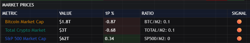
Bitcoin Market Cap
What It Is: The total market capitalization of Bitcoin in US dollars.
Why It Matters: Bitcoin has demonstrated a strong correlation to global liquidity over time. Many consider it a “liquidity barometer” that responds quickly to changes in monetary conditions.
How to Use It:
- Liquidity sensitivity: Bitcoin often moves before traditional markets in response to liquidity changes
- Risk appetite gauge: Strong Bitcoin performance often signals broad risk-on sentiment
- BTC/M2 Ratio: This sub-metric shows Bitcoin’s size relative to money supply
What to Look For:
- Compare Bitcoin’s percentage changes to Net Liquidity changes
- Divergence between Bitcoin and liquidity can signal upcoming reversals
- The ratio to M2 provides context on whether Bitcoin is over or underextended
Total Crypto Market
What It Is: The combined market capitalization of all cryptocurrencies.
Why It Matters: The total crypto market provides a broader view than Bitcoin alone and captures overall crypto market health.
How to Use It:
- Compare to Bitcoin specifically to gauge altcoin strength
- The Total/M2 ratio shows crypto’s size relative to global money supply
- Strong total market with weak Bitcoin suggests altcoin season
S&P 500 Market Cap
What It Is: The total market capitalization of all companies in the S&P 500 index.
Why It Matters: The S&P 500 is the benchmark for US equity markets and global risk appetite.
How to Use It:
- Traditional vs. crypto: Compare S&P performance to crypto to identify rotation
- SP500/M2 Ratio: Shows equity valuations relative to money supply
- Divergence signals: When S&P diverges from liquidity, it often creates opportunities
SECTION 3: MONETARY POLICY SCORECARD
This section provides a country-by-country breakdown of monetary policy stance, allowing you to identify which economies are easing, tightening, or neutral.
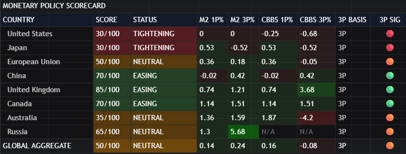
Understanding the Score (0-100)
Each country receives a policy score from 0 to 100 based on its recent central bank balance sheet and M2 money supply changes:
- 67-100 (EASING): Central bank is actively expanding, bullish for local and potentially global assets
- 34-66 (NEUTRAL): Policy is balanced, no strong directional bias
- 0-33 (TIGHTENING): Central bank is contracting, bearish for local and potentially global assets
Country-by-Country Analysis
United States: The most important economy for global markets. US policy sets the tone for global risk appetite.
Japan: The Bank of Japan has historically been among the most accommodative central banks. Changes in Japanese policy can have outsized global effects due to yen carry trades.
European Union: The ECB manages policy for the eurozone. European policy affects global bond markets significantly.
China: The People’s Bank of China operates differently from Western central banks but its policy stance significantly impacts emerging markets and commodities.
United Kingdom: The Bank of England’s policy affects UK assets and provides insight into developed market trends.
Canada: Bank of Canada policy is closely watched for its correlation with US policy and commodity markets.
Australia: Reserve Bank of Australia policy affects Asia-Pacific risk appetite and commodity currencies.
Russia: Included for completeness; M2 data only as central bank balance sheet data is limited.
Column Definitions
- M2 1P% / M2 3P%: Money supply changes over 1 and 3 periods
- CBBS 1P% / CBBS 3P%: Central bank balance sheet changes over 1 and 3 periods
- 3P BASIS: Indicates the calculation is based on 3-period changes
- 3P SIG: Visual signal showing policy direction
What to Look For
- Global coordination: When most countries show green signals, global liquidity conditions are favorable
- Divergence opportunities: When major economies diverge, currency and relative value opportunities emerge
- Leading indicators: Some central banks lead others; watch for policy shifts that may spread
- The Global Aggregate: Provides the overall global monetary policy stance
SECTION 4: LIQUIDITY RATIOS
This section provides derived metrics that offer additional analytical insight.
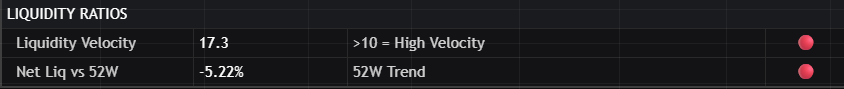
Liquidity Velocity
What It Is: A measure of how quickly money is circulating relative to net liquidity. Higher velocity indicates money is actively moving through the system.
How to Interpret:
- Greater than 10: High velocity – money is moving quickly, potential overheating
- 5-10: Normal velocity – balanced conditions
- Less than 5: Low velocity – money is stagnant, potential for expansion
What to Look For:
- Extremely high velocity can precede market corrections
- Very low velocity often precedes strong rallies when velocity normalizes
Net Liq vs 52W
What It Is: The percentage change in Net Liquidity compared to 52 weeks ago, providing a year-over-year perspective.
How to Interpret:
- Positive: Liquidity conditions are better than a year ago
- Negative: Liquidity conditions are worse than a year ago
What to Look For:
- This provides important context for cycle analysis
- Positive year-over-year readings generally support risk assets
- Trend changes in this metric can signal major regime shifts
INPUT TAB
INPUT TAB
Table Settings / Global Money Supply / Global Central Bank Balance Sheet
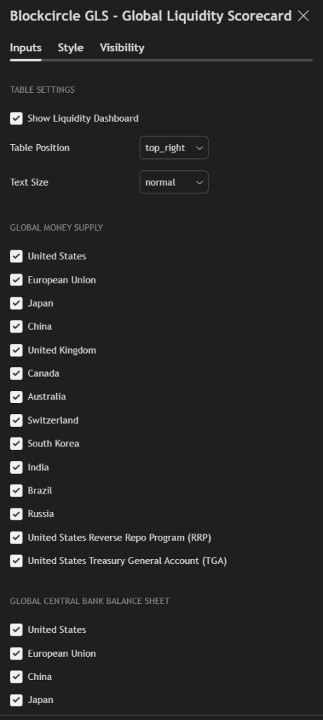
M2 Forward Projection and Moving Averages
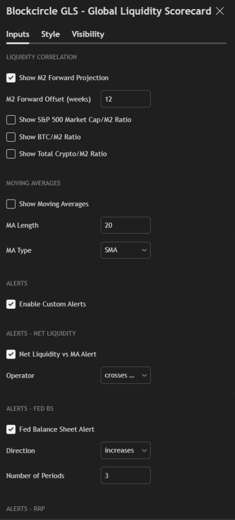
Custom Alerts For Event Triggers
USING THE VISUAL SIGNALS
The GLS uses a consistent visual language throughout:
Background Colors in Percentage Columns:
- Bright Green: Strong expansion (greater than 5%)
- Medium Green: Moderate expansion (2-5%)
- Light Green: Mild expansion (0-2%)
- Light Red: Mild contraction (0 to -2%)
- Medium Red: Moderate contraction (-2 to -5%)
- Bright Red: Strong contraction (greater than -5%)
3P Signal Column:
- Green Circle: Positive 3-period change (expansion)
- Orange Circle: Neutral (small change)
- Red Circle: Negative 3-period change (contraction)
PRACTICAL APPLICATION GUIDE
Bullish Regime Identification
You should have higher conviction for bullish positions when:
- Net Liquidity is positive AND rising
- Global M2 is expanding
- Multiple central banks are easing (scores above 67)
- RRP and TGA are declining
- 3P signals are predominantly green
Bearish Regime Identification
You should be more defensive or consider short positions when:
- Net Liquidity is negative OR declining
- Global M2 is contracting
- Multiple central banks are tightening (scores below 34)
- RRP and TGA are rising
- 3P signals are predominantly red
Transition/Neutral Regime
Exercise caution and reduce position sizes when:
- Mixed signals across metrics
- Central bank scores clustered around 50
- Short-term and long-term changes diverging
- High divergence between countries
TIMEFRAME CONSIDERATIONS
The GLS is designed primarily for weekly analysis but adapts to your chart timeframe:
- Weekly (Recommended): Best for identifying medium-term liquidity regimes
- Daily: More noise, but useful for tactical timing
- Monthly: Big picture view, useful for strategic allocation
The percentage change columns (1P, 3P, 5P, etc.) represent WEEKS when on a weekly chart, DAYS when on a daily chart, and MONTHS when on a monthly chart.
BEST PRACTICES
- Check the GLS weekly at a minimum to stay informed on liquidity conditions
- Focus on Net Liquidity as your primary directional indicator
- Use the Monetary Policy Scorecard to understand the source of liquidity changes
- Watch for divergences between liquidity and asset prices
- Respect regime changes – when signals flip, adjust your positioning accordingly
- Combine with technical analysis – GLS tells you WHAT the liquidity backdrop is; technicals tell you WHEN to act
"Member since 2018. The real value is in the Discord and the market data. Basel and Hunter provide a perfect blend of expertise."
"Best subscription I've ever had. High ROI. Phenomenal community. Founders are top 1% in vision and innovation."
"No team better than Blockcircle. The alpha you get here you cannot find anywhere else."
"Basel and Hunter are godsends for anyone trying to navigate the crypto space."
"Best crypto group. I can't believe the guys who run this are so transparent and helpful."