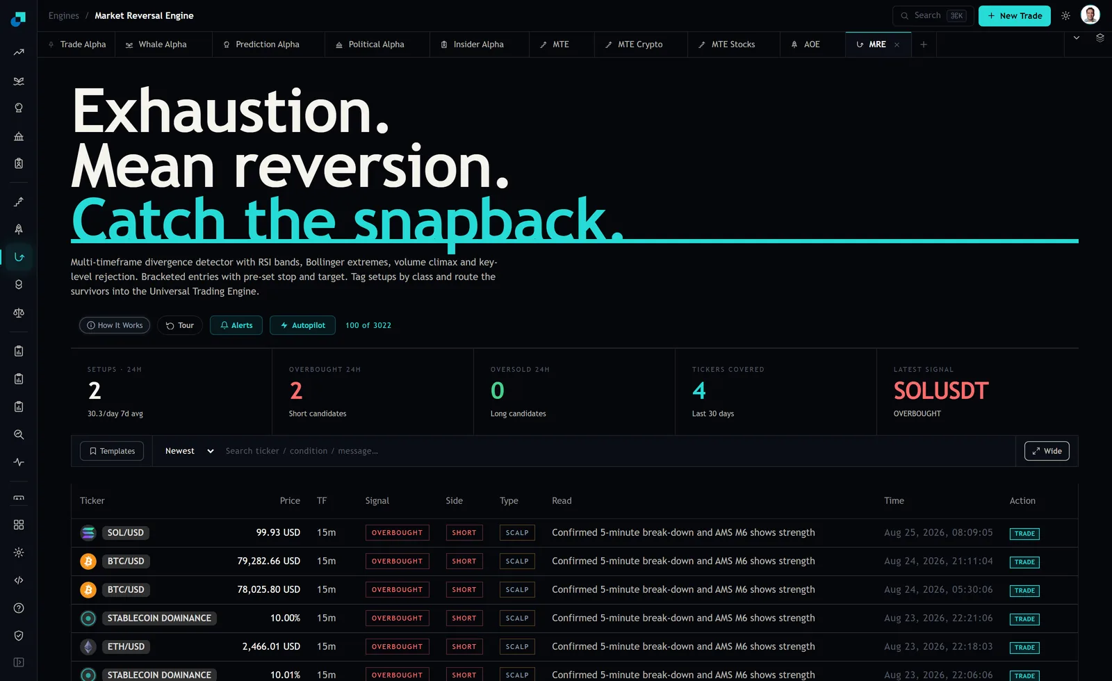
There is a row in the MRE feed that quotes a price of 10.00 percent. Everything around it quotes dollars. SOL/USD at 99.93, BTC/USD at 79,282.66, ETH/USD at 2,466.01, and then STABLECOIN DOMINANCE at 10.00, carrying the same OVERBOUGHT tag, the same SHORT side, the same SCALP type and the same 15m timeframe as the rows above it.
The obvious first reading is that the engine wants you short something. You cannot be short it. There is no venue where you sell stablecoin dominance, and the percent sign in the price column is the panel telling you that. The row is still worth more to a small account than most of the rows you can trade, but only after you translate it, and the translation is a thing you do rather than a thing the panel hands you.
What is actually behind that ticker
The alert definitions behind these rows, which the platform tags as native to MRE, name the instrument explicitly. It is not one symbol. It is a composite of three dominance series added together: USDC dominance plus USDT dominance plus DAI dominance. So the 10.00 in the price column is a share. Ten cents of every dollar of crypto market capitalisation, at that moment, was sitting in one of those three dollar tokens rather than in anything with a price that can move.
That reframing matters because it changes what an oscillator reading on the series means. RSI above 80 on BTC means bitcoin has risen fast against its own recent range. RSI above 80 on a dominance composite does not mean stablecoins got expensive. They are pegged. It means the share parked in them has climbed fast, which is a statement about everyone else's positioning, not about the price of USDC.
Why a stretched share is a crowded sideline rather than an expensive asset
Think about what has to happen for that share to climb. Either people sold coins and held the proceeds in stables, or the value of everything that is not a stablecoin fell, or both. All three routes describe the same condition: a lot of capital that is inside crypto has stepped out of risk without leaving.
A mean reversion signal on that series is a claim that the stepping out has gone as far as it usually goes before it unwinds. If it unwinds, the share falls, and the money that was parked has to go somewhere. The candidates are the same three assets sitting above it on the screen, which is why the row is not a footnote. The engine watched four tickers over the last thirty days, so stablecoin dominance is a quarter of the feed, not a curiosity.
Be precise about what MRE is and is not doing here, because this is where people invent a feature that does not exist. The engine scores the dominance composite exactly the way it scores BTC, and it emits OVERBOUGHT with side SHORT. It does not publish a translated long on bitcoin off the back of that row. If you want the risk-on trade, you take it yourself, and it arrives without the pre-set stop and target that ship with the tradeable setups.
The identity that decides whether it is actually bullish
Dominance is a ratio, and ratios fall for two very different reasons. Write the stablecoin share as S divided by the quantity S plus R, where S is the stablecoin market capitalisation and R is everything else. That share can fall because R grew, or because S shrank.
Those two worlds look identical on the dominance chart and could not be more different for your account. R growing is money moving off the sidelines into coins, which is the reading the whole inversion argument rests on. S shrinking is redemptions, capital leaving crypto entirely, and it can happen while coin prices are flat or falling. The dominance row cannot tell you which one you are in, and neither can the RSI on it.
The check takes fifteen seconds and it is not optional. Look at whether the dollar-priced rows are actually rising over the same window. If dominance is compressing and BTC, ETH and SOL are grinding higher, the denominator is doing the work and the inversion holds. If dominance is compressing while those three are flat or lower, you are watching money leave the building, and buying into it because a ratio mean reverted is a bad trade with a clever story attached.
Two prints fifteen minutes apart, and why they are one observation
Look at the timestamps on the two dominance rows in the capture. One is stamped Aug 23 2026 at 22:06:06 with a price of 10.01 percent. The next is stamped 22:21:06 with a price of 10.00 percent. Fifteen minutes apart, and the series moved one hundredth of a percentage point.
That is worth sitting with. The alert configuration behind these setups runs on a 15m timeframe with a fifteen minute cooldown, so consecutive prints on the same instrument are exactly what you would expect when a condition stays true. What you get in the feed is two rows. What actually happened in the world is one condition that persisted, on a series that barely moved.
The practical rule that follows is simple. Collapse repeated dominance prints into a single observation and treat the first one as the timestamp. If you count rows instead, a slow ratio sitting at the top of its range will generate a steady drip of prints and it will feel like mounting evidence. It is not mounting evidence. It is the same evidence, printed again, and reacting to the third print as though it were three times the signal is how a context flag turns into an oversized position.
What to do with a dominance row this week
Treat it as a flag on the rest of the feed, valid until the next dominance print contradicts it, and let it change your ordering rather than your sizing.
- If you already hold BTC, ETH or SOL, the row is not an instruction to add. It is a reason not to trim into strength this week.
- If you have a shortlist and cash waiting, this is a reasonable day to put the first tranche in. Size it exactly as you would have without the row. A context flag is not a conviction multiplier.
- Do not open a position on the dominance row itself. It is not an instrument you can hold, and any attempt to express it through a proxy adds a second trade you did not analyse.
- Write down the invalidation before you act. Mine is one line: if the dollar-priced rows are not rising while the share compresses, the risk-on read is wrong and I stand down.
The reason this row earns its place in a retail routine is that it is the only one on the screen that describes the pool of money rather than a price. Everything else in the feed tells you what an asset just did. The dominance composite tells you how much dry powder is standing behind it. When that number is stretched and starts to unwind, you are being told the sideline is emptying, and the useful thing about being told early is not that it makes you right. It is that it stops you from selling your position to the people who are about to be buyers.