Every activity metric in crypto is trying to answer the same question: is anybody actually using this thing. The metrics differ in how easy they are to fake, and that is the only property worth ranking them on.
A count of transactions is at the easy end. A revenue figure is at the hard end, because revenue requires somebody to have parted with money. When those two disagree, the disagreement is usually more informative than either number on its own, and it takes about two minutes to look at.
What the panel actually labels, which is not quite fees against counts
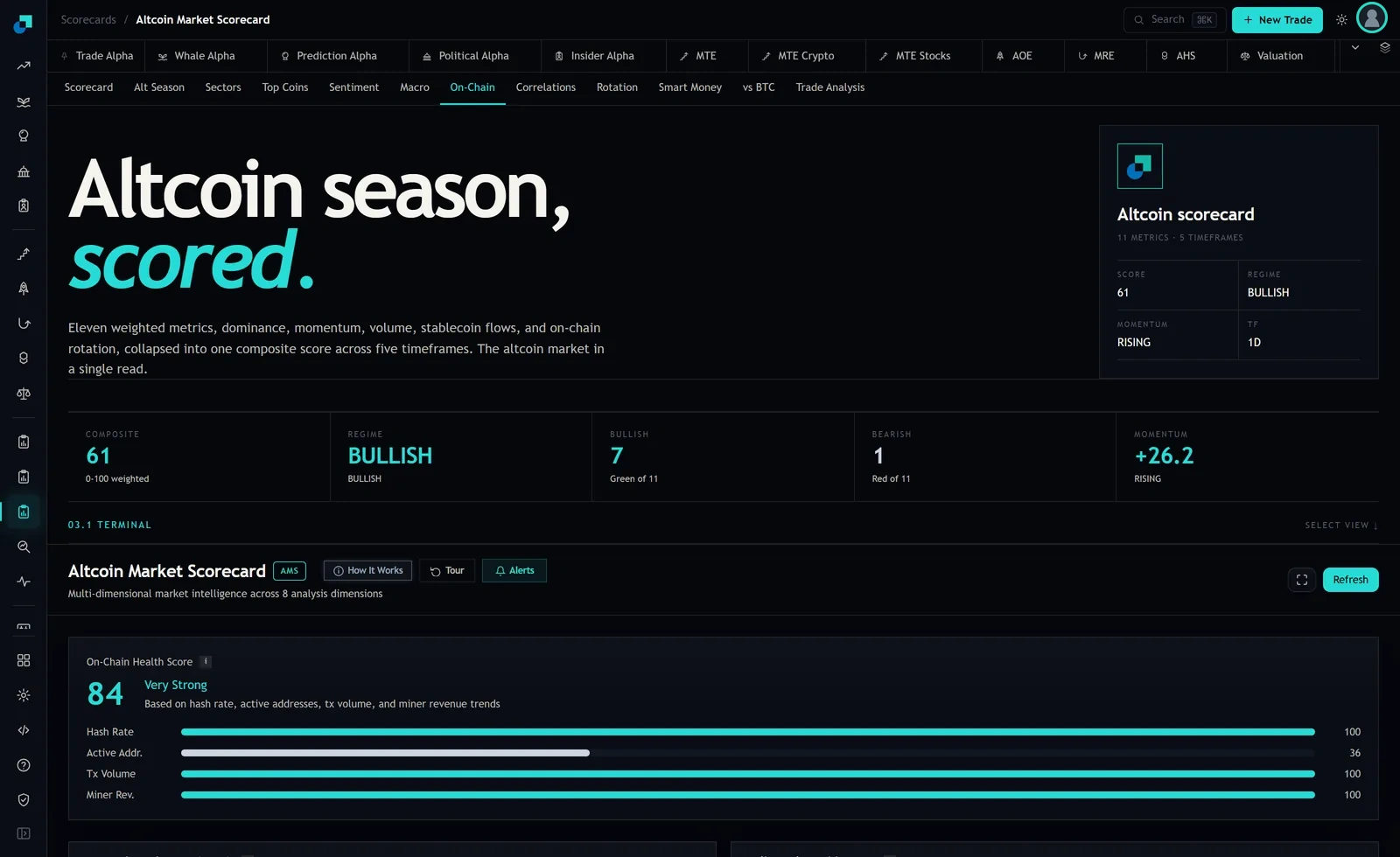
Start with what is on the screen, because the labels matter and it is worth being precise rather than reading what you expect to see. The On-Chain tab shows a health score of 84 built from four inputs, named on the panel as hash rate, active addresses, transaction volume and miner revenue trends. The bars read Hash Rate 100, Active Addr. 36, Tx Volume 100, Miner Rev. 100.
Two clarifications before using any of that. Transaction volume is a volume row, meaning value moved, which is a different thing from a count of transactions. And miner revenue on a proof of work chain is the block subsidy plus transaction fees together, so it is revenue-shaped but it is not a fee line, and the panel does not break the two apart. Treat it as the closest thing on this screen to a read on what users paid, while remembering that a chunk of it is issuance that gets paid whether anyone transacts or not.
That is a limitation and it is also the reason this piece exists. If you want the fee component on its own you have to go to the chain's own data. What the panel gives you is the shape of the argument and one genuinely interesting divergence, which is further down.
Why a count is the easiest number in crypto to produce
Think about what it takes to add one to a transaction count on a chain where fees are close to nothing. You need a wallet, a fraction of a cent, and a script. That is the entire cost of manufacturing the metric. Multiply by a few thousand wallets and you have a chart that goes up and to the right, and nothing in that chart requires a single human being to have wanted anything.
The incentives to do exactly this are strong and public. Airdrop campaigns reward addresses that have transacted. Incentive programs and points schemes reward volume. Ecosystem funds pay for usage milestones. None of that is fraud, it is marketing with a budget, and it produces real transactions in the same way that a two for one offer produces real sales. The question is what happens to the number when the offer stops.
The general point is uncomfortable but simple. On a chain with very cheap blockspace, a count tells you at least as much about the price of blockspace as it does about demand for it. Two chains with identical counts and very different fee levels are not seeing the same thing at all.
A fee is a price somebody agreed to pay
Revenue survives that problem because it is denominated in something the participant had to give up. A transaction that paid a meaningful fee is evidence that somebody valued inclusion more than the money, which is exactly the thing you were trying to measure in the first place.
It is not immune, and the exception is worth naming so you can check for it. Fees can be sponsored. A protocol can rebate gas, a wallet can subsidise it, an application can pay on the user's behalf. That does not make the fee fake, the money genuinely moved, but it moves the question from whether the fee was paid to who paid it. So when a fee or revenue line jumps, the follow up is always the same: was that users paying, or was that a treasury paying on behalf of users, and how long is the budget.
The second reason to prefer a revenue read is that it aggregates honestly. Ten thousand transactions of a cent each and one transaction of a hundred dollars look identical in a count and completely different in revenue, and for almost any decision you are making, the second description is the one you want.
The divergence on this screen and the question it raises
Now the interesting reading. On this panel, transaction volume and miner revenue are both at 100 while active addresses sit at 36. Value moving and revenue earned are at the top of their range, while the count of distinct participating addresses is at roughly a third of its own.
That is a concentration reading. Fewer distinct addresses are responsible for throughput that is near the top of its range. And I want to be careful here, because this is where people leap. It does not tell you the activity is farmed. It is equally consistent with large, professional participants doing the moving, which is a perfectly healthy thing and arguably a sign of maturity rather than weakness.
What it does is generate a specific question with a specific answer, which is what a good divergence should do. The question is whether the throughput is coming from a small number of large economic actors or a small number of automated ones. The distinction matters because the first kind keeps transacting when incentives end and the second does not. You settle it by looking at the distribution of transaction sizes and the concentration of the largest addresses, not by staring harder at an aggregate.
The reverse divergence is the one that should worry you more, and it is the classic farmed-activity tell. Counts and addresses rising while fee revenue is flat or falling means more transactions are happening and each one is worth less, which is the arithmetic signature of activity that exists because it is cheap or because it is being paid for, rather than because it is wanted.
The check to run on a token you own this week
Pick one token in your account and spend ten minutes on this. It is more useful than another hour of reading about the sector.
Find two series for its chain or protocol: a fee or revenue series, and a count or address series. Most chains publish both, and the project's own dashboard or a public explorer will have them. Plot them over the last six months, or just read the two charts side by side.
Then answer three questions in writing. Are they moving together, and if not, which one is moving. If the count is rising faster than the revenue, what is paying for the difference, and is that program disclosed with an end date. And what did the fee line do the last time an incentive program ended, because that is the closest thing you have to a test of what the demand looks like without the subsidy.
If a token's activity story survives all three questions, you own something people pay to use. If it does not, you may still want to own it, plenty of things go up for other reasons, but you should stop describing the position to yourself as being about adoption. That is the part that costs money later: not holding the wrong token, but holding it for a reason that was never true, which makes it impossible to know when the reason has stopped being true.