There is more automated market commentary reaching you every week than there was last week, and the median piece of it is competent, fluent and impossible to argue with. That last property is the problem. Fluent text that cannot be checked is not information, it is atmosphere, and atmosphere leaks into position sizing without ever passing through a decision.
The filter I use is three questions, asked in order, before reading anything closely. It takes under a minute and it is deliberately not a judgement of whether the view is correct. It is a judgement of whether the view is checkable, which is a much easier question and turns out to be the one that matters.
What data is this built on
Ask what the write-up is measuring, and require the answer to be a named quantity rather than a category. "On-chain data" is not an answer. "Stablecoin dominance" is an answer, because it is a specific number that exists whether or not anyone writes about it.
The distinction is easy to apply once you have used it a few times. A named input can be checked by you, on a different source, in ten seconds. An unnamed input cannot be checked by anyone, which is what makes it comfortable to write.
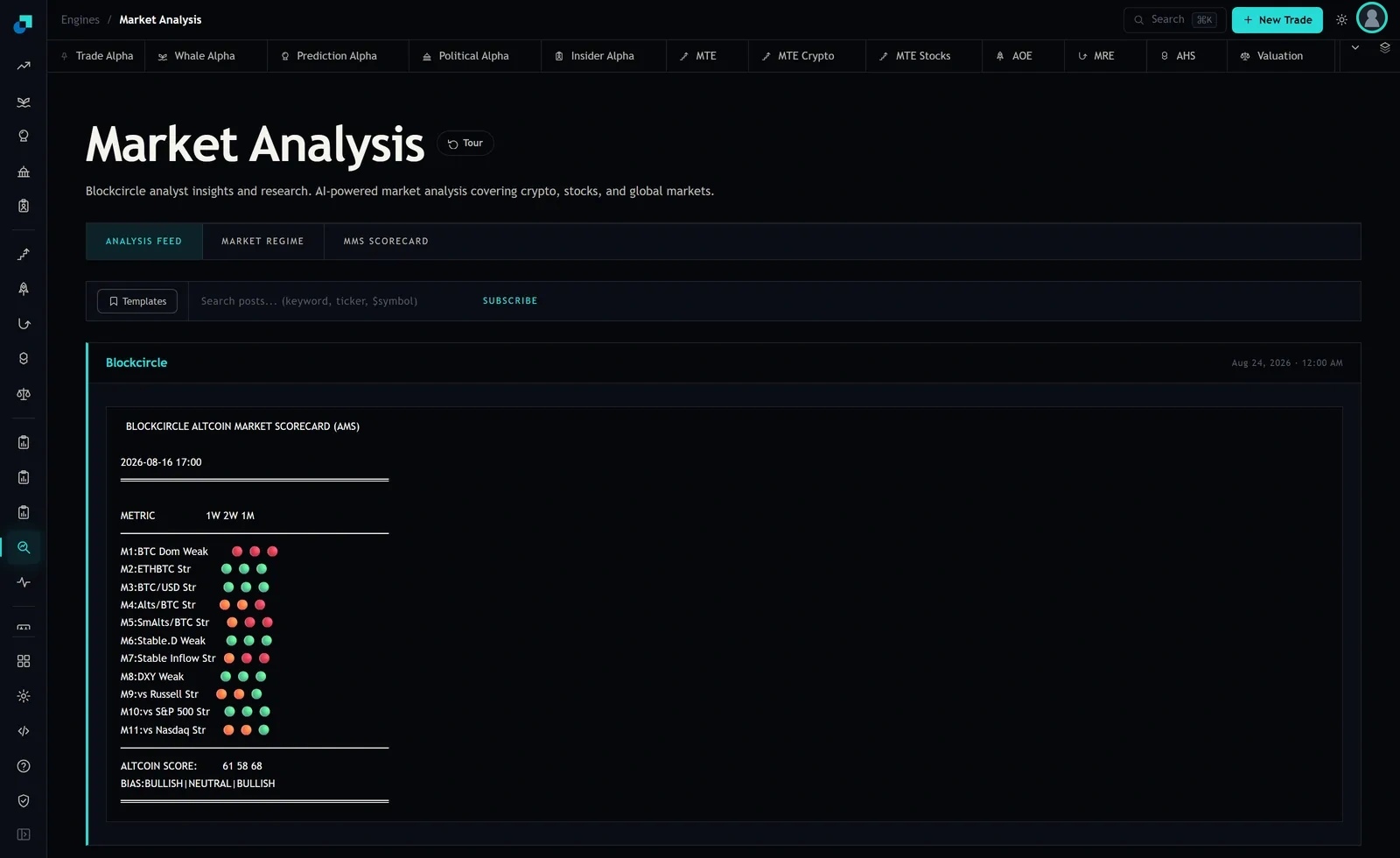
The good version of this looks like a list. The scorecard in the capture below names eleven separate inputs and shows each one's state individually, so a reader who disagrees with the conclusion can find the exact row they disagree with. That is a much higher standard than prose commentary usually reaches, and it costs the author something: every named row is a row that can be shown to be wrong.
When the answer to question one is a list, keep reading. When it is a category, you can stop, and the stopping is the point of the exercise. You have just saved yourself ten minutes and a vague opinion you would have absorbed without meaning to.
Over what window, and as of when
The second question has two halves and both of them get skipped.
The first half is the measurement window. "Momentum is strong" is not a claim until you know whether that means three days or three months, because those regularly disagree. The card in the capture answers this explicitly by printing three columns, 1W, 2W and 1M, and the answers differ: the bias line reads bullish, neutral, bullish, and the scores read 61, 58 and 68. One artifact, three windows, three different messages. A write-up that gives you a single directional word without a window has quietly picked one for you, and it will have picked the flattering one.
The second half is vintage, meaning when the data was taken. This is the one that catches people, and this card shows why. The feed header stamps the post Aug 24, 2026 at 12:00 AM while the scorecard printed inside carries its own stamp of 2026-08-16 17:00. Eight days apart. If you read the header as the data date, you are treating a week-old market reading as this morning's, and a week is long enough for several of those rows to flip.
So the habit to build is to look for a stamp inside the content rather than on the container. A post date tells you when something was posted. It does not tell you when the numbers in it were measured, and on automated output those two are frequently not the same thing.
What would make this wrong
The third question is the strongest and it is the one almost no commentary survives. Ask what observable event would cause the author to say the view had failed.
If the answer is on the page, the write-up is a thesis. If you cannot construct one from the text, it is a description of the recent past with a directional adjective on it, and it will be equally consistent with whatever happens next.
The tell is a conditional that cannot lose. "If support holds, expect continuation" is true either way: continuation confirms it, and a break means the condition was not met. Sentences with this shape can be deleted without losing information and there are usually several in any given note.
Where the write-up gives you a structured view, you can build the flip condition yourself, which is the best case. On a card of eleven scored rows, the flip condition for the whole view is simply which rows would have to change colour for the bias line to move, and you can watch two or three of them directly. That converts something you read into something you monitor, and monitoring is the only form of reading that changes what you do later.
Scoring the answers
Three questions, three answers, and a rule for each score so the checklist ends in an action rather than an impression.
- Three out of three: usable. Named inputs, a stated window, a flip condition. Pick the single row that touches a position you actually hold and check it yourself on your own chart. That is the whole use of the note.
- Two out of three: usable as a prompt, never as a reason. Read it, note the claim, and go and get the missing piece yourself before it affects anything. Most structured output lands here, usually failing on the flip condition.
- One out of three: entertainment. You are allowed to read it. You are not allowed to size on it, and the risk is that you will do so anyway without noticing, which is why the score is worth saying out loud.
- Zero: close the tab.
The value of a written scale is that it stops you grading on style. Well-produced commentary with charts and confident structure scores zero surprisingly often, and scrappy output that names its inputs scores three. The polish and the checkability are unrelated and your instinct will conflate them every time.
What the checklist deliberately ignores
Three things are missing from this list on purpose, and knowing why keeps the tool honest.
It does not ask whether the view is correct. You cannot assess that in a minute and neither can anyone else. Checkability is a property you can evaluate immediately, and it is the property that determines whether you will find out that you were wrong in time to do something about it.
It does not ask who or what wrote it. Machine-generated output is not automatically worse than human commentary and it is frequently better on question one, since a template that prints its inputs is more disciplined than most people writing at speed. Judge the artifact, not the author.
It does not ask for a price target. Targets are the part of a write-up with the least information in it and the most influence over readers, which is a bad combination. A note that names its inputs, its window and its flip condition and offers no target at all is more useful than the reverse, and if you find yourself remembering only the number, you have read the note backwards.