
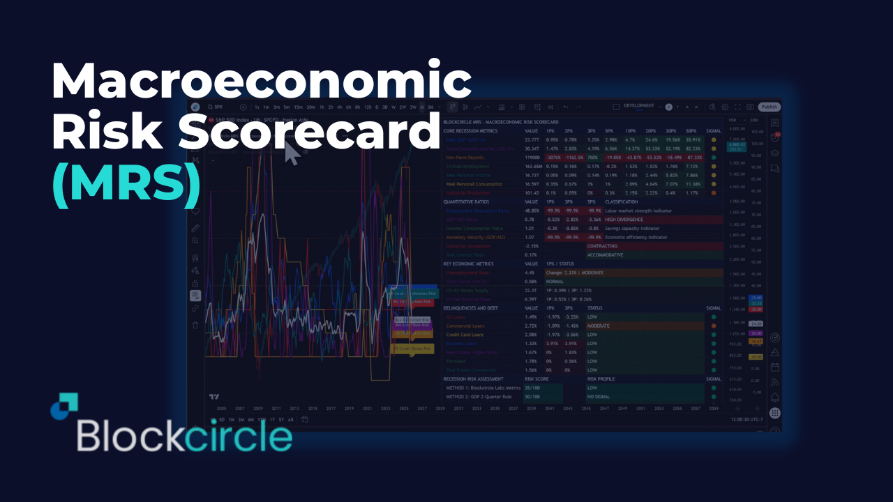
Blockcircle Macroeconomic Risk Scorecard (MRS) – User Guide
COMPLETE SETUP & CONFIGURATION MANUAL
PREREQUISITES & INITIAL SETUP
Before beginning, ensure you have:
- A TradingView account (minimum Essential, preferably Plus+)
- Active Blockcircle subscription
Account Integration Process
- TradingView Account Creation -> Navigate to TradingView.com and create your account. Choose a username carefully, as this will be permanent and case-sensitive. Write down your exact username, including any numbers, underscores, or capital letters. For example, if you register as “Blockcircle_Trader1234”, this exact format must be used everywhere.
- Blockcircle Integration Visit blockcircle.com/account and enter your TradingView username exactly as registered. The system performs case-sensitive matching – “Blockcircle_Trader1234” will not match “blockcircle_trader1234”. After entering your username, you’ll receive access to the Blockcircle MRS – Macroeconomic Risk Scorecard.
- Accessing Your Trading Chart -> Once logged into TradingView, click “Chart” in the top navigation menu. You’ll see a default chart appear. To change the trading pair, click the symbol in the top-left corner (usually showing “AAPL” or another default). Type your desired pair, such as “BTCUSDT,” and select the appropriate exchange (BINANCE, COINBASE, KRAKEN, etc.).
- Timeframe Selection Above the chart, you’ll see timeframe options (1m, 5m, 15m, 1h, 4h, D, W, M).
- Adding Blockcircle MRS – Macroeconomic Risk Scorecard to Your Chart -> Click the “Indicators” button (looks like ƒx) at the top of your chart. In the search window that appears, navigate to the “Invite-Only” tab. You should see “Blockcircle MRS – Macroeconomic Risk Scorecard” if your account has been granted access. Click on it once to add it to your chart.
1. Introduction and Overview
What is the Blockcircle MRS?
The Blockcircle Macroeconomic Risk Scorecard (MRS) is a comprehensive real-time economic analysis scorecard designed to provide investors, traders, and financial professionals with an immediate, visual assessment of macroeconomic conditions and recession risk. The MRS synthesizes over 30 economic data points from different established sources and custom economic indicators into a single, actionable scorecard.
Why Use the MRS?
Financial markets are forward-looking mechanisms that respond to macroeconomic conditions often before those conditions become apparent to the general public. Tracking macroeconomic forces and geopolitical events is crucial for all long-term investors and traders. By monitoring the economic indicators that historically precede market movements and economic turning points, the MRS empowers users to:
- Anticipate Market Regime Changes: Identify when economic conditions are shifting from expansion to contraction, or vice versa, before these shifts are widely recognized. For example, we monitor the US Federal Reserve balance sheet closely as it usually is a key prerequisite for macro risk-on or macro risk-off.
- Manage Portfolio Risk: Adjust exposure to risk assets based on objective economic data rather than emotional reactions or false media narratives
- Understand the Economic Landscape: Gain a comprehensive view of economic health across multiple dimensions simultaneously
- Make Informed Decisions: Base investment and trading decisions on quantitative economic analysis rather than speculation
The Philosophy Behind the MRS
The MRS is built on the principle that no single economic indicator tells the complete story. Economic health is multidimensional-employment can be strong while manufacturing weakens; GDP can grow while underlying income metrics deteriorate. By presenting multiple indicators across multiple timeframes, the MRS provides the complete picture necessary for informed decision-making.
2. Getting Started
Recommended Chart Settings
- Timeframe: The MRS works on any timeframe, but daily or weekly charts provide the cleanest visualization since most underlying economic data is released monthly or quarterly
- Symbol: The MRS can be applied to any chart as it pulls its own data feeds-apply it to your primary asset (e.g. BTC/USD, SPX500, NDX100 etc) for convenient reference
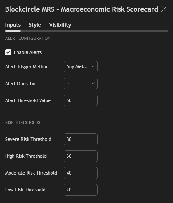
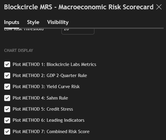
3. Display Settings Configuration
Access all settings by clicking the gear icon on the indicator or double-clicking the indicator name in your chart’s indicator list.
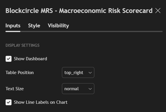
Inputs Tab
Show Dashboard
Default: Enabled Purpose: Toggles the entire scorecard table on or off. Disable this if you only want to view the plotted risk scores on the chart without the detailed table.
Table Position
Options: top_left, top_center, top_right, middle_left, middle_center, middle_right, bottom_left, bottom_center, bottom_right Default: top_right Purpose: Determines where the scorecard appears on your chart. Choose a position that doesn’t obscure important price action for your trading style.
Text Size
Options: tiny, small, normal, large, huge Default: normal Purpose: Adjusts the font size throughout the scorecard . Use smaller sizes on monitors with limited space, larger sizes for presentation or accessibility needs.
Show Line Labels on Chart
Default: Enabled Purpose: When risk scores are plotted on the chart, this setting adds identifying labels to help distinguish between different risk methodologies.
Risk Calculation
Choose which risk calculation method to use or stay with the combined approach which is enabled by default
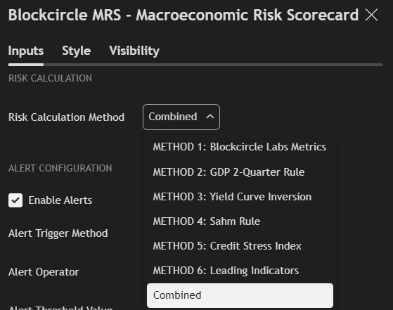
MRS Alert Settings
You can set custom alerts based upon important thresholds being breached or trigger them based upon high risk, moderate risk, or low risk
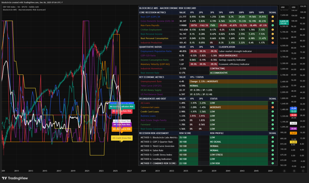
4. Scorecard Sections Explained, Step-by-Step
The MRS scorecard is organized into five distinct sections, each serving a specific analytical purpose:
- Core Recession Metrics: The fundamental economic indicators used by professional economists and the National Bureau of Economic Research (NBER) to assess economic conditions
- Quantitative Ratios: Derived metrics that reveal relationships between economic variables and provide insight into economic efficiency and balance
- Key Economic Metrics: Supporting indicators that provide additional context for economic assessment
- Delinquencies and Debt: Credit market stress indicators that often serve as early warning signals for economic trouble
- Recession Risk Assessment: The six distinct methodologies for calculating recession probability, plus the combined score
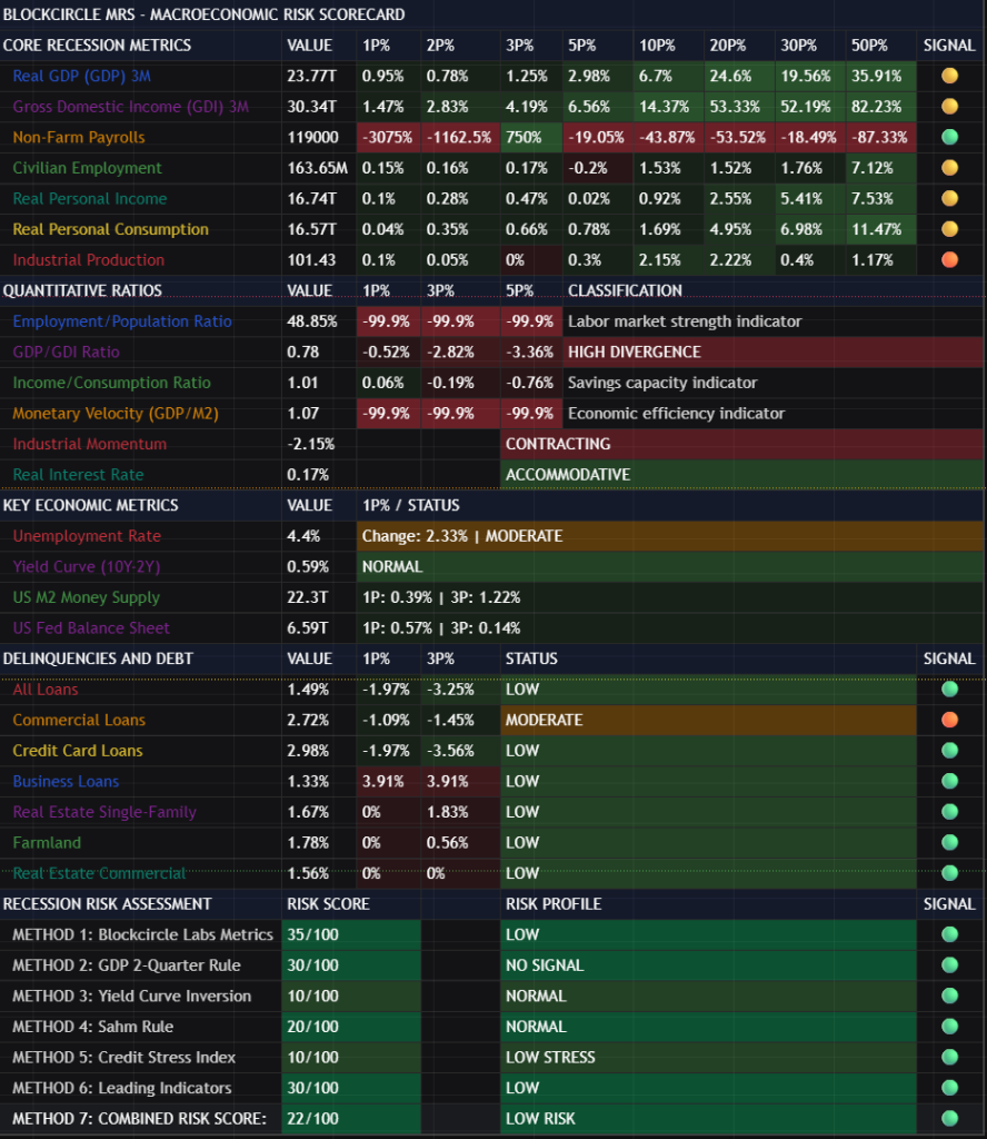
5. Core Recession Metrics
This section displays the primary economic indicators that form the backbone of recession analysis. These are the same metrics that the NBER’s Business Cycle Dating Committee examines when determining the official start and end dates of recessions.
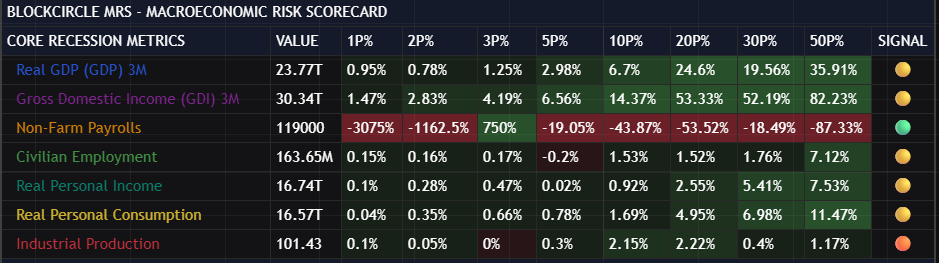
Understanding the Column Headers
- VALUE: The current reading of the indicator in its native units
- 1P%: Percentage change from 1 period ago
- 2P%: Percentage change from 2 periods ago
- 3P%: Percentage change from 3 periods ago
- 5P%: Percentage change from 5 periods ago
- 10P%: Percentage change from 10 periods ago
- 20P%: Percentage change from 20 periods ago
- 30P%: Percentage change from 30 periods ago
- 50P%: Percentage change from 50 periods ago
- SIGNAL: Visual indicator summarizing the metric’s current status
Note on Periods: The period length depends on the native frequency of each data series. For monthly data, 3P means 3 months; for quarterly data, 3P means 3 quarters (9 months).
Real GDP (Quarterly)
What It Measures: Real Gross Domestic Product is the total value of all goods and services produced within a country’s borders, adjusted for inflation. It is the broadest measure of economic output.
Why It Matters: GDP is the most widely recognized measure of economic health. Two consecutive quarters of declining GDP has historically been used as a simple (though not official) definition of recession.
What To Watch For:
- Consistent positive readings across all timeframes indicate healthy economic expansion
- Negative short-term readings (1P%, 2P%) with positive longer-term readings may indicate a temporary slowdown
- Negative readings across multiple timeframes suggest sustained economic contraction
- Pay particular attention to the 1P% and 2P% columns-consecutive negative readings here trigger the “GDP 2-Quarter Rule” risk methodology
Healthy Range: Growth of 2-3% annually (approximately 0.5-0.75% quarterly) is considered sustainable. Growth above 4% annually may indicate overheating; negative growth indicates contraction.
Gross Domestic Income (GDI) (Quarterly)
What It Measures: GDI measures the economy from the income side-the total income earned by all participants in the economy. In theory, GDI should equal GDP since every dollar spent (GDP) becomes someone’s income (GDI).
Why It Matters: GDI often provides earlier signals of economic turning points than GDP. When GDI diverges significantly from GDP, it may indicate measurement issues or structural economic shifts that warrant attention.
What To Watch For:
- Compare GDI readings to GDP readings in the same row-significant divergence is a warning sign
- GDI declining while GDP remains positive may indicate that corporate profits are being squeezed or labor income is falling
- Sustained divergence between GDP and GDI is captured in the “GDP/GDI Ratio” in the Quantitative Ratios section
Healthy Range: Should track closely with GDP. Divergence of more than 2% is notable; divergence of more than 5% is concerning.
Non-Farm Payrolls
What It Measures: The total number of paid workers in the United States, excluding farm employees, government workers, private household employees, and employees of nonprofit organizations.
Why It Matters: Employment is a lagging indicator-it typically doesn’t decline until a recession is already underway-but it’s crucial for confirming economic conditions and assessing the severity of downturns.
What To Watch For:
- Consistent job growth (positive readings) indicates economic expansion
- Slowing growth (declining positive percentages across timeframes) may precede job losses
- Negative readings indicate job losses, a serious warning sign
- Monthly job reports are among the most market-moving economic releases; the MRS shows you the trend beyond single monthly readings
Healthy Range: The economy needs to add approximately 100,000-150,000 jobs per month to keep pace with population growth. Readings significantly above this indicate strong expansion; readings below indicate weakening.
Civilian Employment
What It Measures: The total number of employed civilians aged 16 and over, including farm workers, self-employed individuals, and other categories not captured by non-farm payrolls.
Why It Matters: This broader measure of employment captures trends that payrolls might miss, particularly in entrepreneurship and the gig economy.
What To Watch For:
- Compare trends to Non-Farm Payrolls-divergence may indicate structural shifts in employment
- This measure is used in the Sahm Rule calculation, one of the most reliable recession indicators
- Watch for accelerating declines, which indicate rapidly deteriorating labor market conditions
Healthy Range: Should show consistent growth during expansions. Negative readings, particularly sustained negative readings, indicate recession conditions.
Real Personal Income
What It Measures: The total income received by individuals from all sources, adjusted for inflation. This excludes government transfer payments to provide a clearer picture of earned income.
Why It Matters: Income drives consumption, which drives approximately 70% of the US economy. Declining real income, especially when sustained, leads to reduced spending and economic contraction.
What To Watch For:
- Income should grow at least as fast as consumption for sustainable economic growth
- Negative readings indicate purchasing power is declining
- Compare to the Income/Consumption Ratio in Quantitative Ratios for a fuller picture
- Sustained negative readings often precede or coincide with recessions
Healthy Range: Real income growth of 2-4% annually is healthy. Growth below inflation (negative real growth) is concerning.
Real Personal Consumption
What It Measures: Total spending by consumers on goods and services, adjusted for inflation.
Why It Matters: Consumer spending is the largest component of GDP. Consumer behavior often signals economic turning points, as households typically reduce spending before official economic indicators reflect a downturn.
What To Watch For:
- Consumption typically remains positive even during mild slowdowns-negative readings are serious
- Declining growth rates (positive but shrinking percentages) may indicate consumer stress
- Compare to income trends-consumption growing faster than income is unsustainable
- Watch for divergence between consumption and income, which indicates either savings drawdown or credit expansion
Healthy Range: Consumption growth should broadly track income growth. Sustained growth of 2-3% annually is healthy.
Industrial Production
What It Measures: An index measuring the real output of manufacturing, mining, and electric and gas utilities.
Why It Matters: Industrial production is more cyclically sensitive than the broader economy. It often leads economic turning points, declining before overall GDP and recovering before overall GDP during recessions.
What To Watch For:
- This is displayed as an index value, not a dollar amount-watch the percentage changes
- Industrial production is more volatile than GDP-brief negative readings are less concerning than sustained declines
- Significant negative readings across multiple timeframes indicate manufacturing recession
- The “Industrial Momentum” metric in Quantitative Ratios provides additional context
Healthy Range: Positive growth is expected during expansions. The industrial sector can experience brief contractions without indicating broader recession, but sustained declines of 3+ months are concerning.
Interpreting the Signal Column
The rightmost column provides a quick visual summary using a traffic light system:
- Green Circle: Healthy positive change (typically >5% for the reference period)
- Yellow Circle: Modest positive change or minimal negative change
- Orange Circle: Notable negative change
- Red Circle: Significant negative change indicating stress
The signal is based on the 3-period percentage change for most metrics, providing a medium-term trend assessment.
6. Quantitative Ratios
This section presents derived metrics that reveal relationships between economic variables. These ratios often provide insight not visible in the raw data.
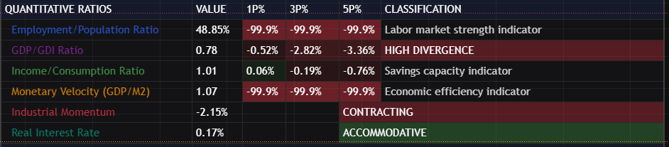
Employment/Population Ratio
What It Measures: The percentage of the working-age population that is employed.
Why It Matters: Unlike the unemployment rate, this ratio captures people who have stopped looking for work. A declining employment/population ratio may indicate “hidden” unemployment not reflected in official statistics.
Classification:
- Labor Market Strength Indicator: Higher ratios indicate more of the population is engaged in productive work
What To Watch For:
- Historical range is roughly 55-65%
- Declining ratios suggest labor market weakness even if unemployment rate appears stable
- Rising ratios during recovery indicate people are returning to the workforce
GDP/GDI Ratio
What It Measures: The ratio between the expenditure-side measure of economic output (GDP) and the income-side measure (GDI).
Why It Matters: In theory, these should be equal. Persistent divergence indicates data collection issues or structural economic changes that may not be fully captured in either measure alone.
Classification System:
- NORMAL: Ratio close to 1.00 (within 2%)
- MODERATE: Ratio divergence of 2-5%
- HIGH DIVERGENCE: Ratio divergence exceeds 5%
What To Watch For:
- Ratios above 1.0 indicate GDP is measuring higher than GDI
- Ratios below 1.0 indicate GDI is measuring higher than GDP
- Large divergences are often revised away in subsequent data releases
- Persistent divergence in one direction may indicate systematic measurement issues
Income/Consumption Ratio
What It Measures: The ratio between personal income and personal consumption.
Why It Matters: This ratio indicates whether households have “room” in their budgets-whether income exceeds spending, allowing for savings and financial resilience.
Classification:
- Savings Capacity Indicator: Ratios above 1.0 indicate income exceeds consumption
What To Watch For:
- Ratios above 1.0 indicate that healthy households have money left over after consumption
- Ratios approaching or below 1.0 indicate households are spending everything they earn
- Declining ratios suggest increasing financial stress, even if absolute income is growing
- During economic stress, this ratio often declines as households draw on savings
Monetary Velocity (GDP/M2)
What It Measures: How quickly money circulates through the economy, the ratio of economic output to money supply.
Why It Matters: Velocity indicates economic efficiency. High velocity suggests money is being actively used for transactions; low velocity suggests money is being hoarded or held in financial assets rather than circulating through the economy.
Classification:
- Economic Efficiency Indicator: Higher velocity indicates more economic activity per unit of money
What To Watch For:
- Velocity has been declining for decades due to structural changes in the economy
- Sharp declines in velocity may indicate risk aversion and economic uncertainty
- Rising velocity during recoveries indicates confidence is returning
- Compare changes rather than absolute levels, given the long-term declining trend
Industrial Momentum
What It Measures: The acceleration or deceleration of industrial production-comparing recent changes to longer-term changes.
Why It Matters: Momentum indicates whether conditions are improving or deteriorating, providing earlier signals than absolute levels.
Classification System:
- ACCELERATING: Positive momentum-recent performance exceeds longer-term performance
- SLOWING: Negative momentum but still relatively mild
- CONTRACTING: Significantly negative momentum indicating rapid deterioration
What To Watch For:
- Positive momentum during expansions confirms healthy growth
- Slowing momentum may precede outright contraction
- Deeply negative momentum during contractions indicates severe industrial stress
Real Interest Rate
What It Measures: The Federal Funds rate minus the inflation rate-the “true” cost of borrowing after accounting for inflation.
Why It Matters: Real interest rates determine whether monetary policy is actually restrictive or accommodative. A 5% interest rate is restrictive when inflation is 2% but accommodative when inflation is 7%.
Classification System:
- ACCOMMODATIVE: Negative or very low real rates policy supports economic growth
- NEUTRAL: Modest positive real rates policy neither stimulates nor restricts
- RESTRICTIVE: High positive real rates-policy restrains economic activity
What To Watch For:
- Sustained restrictive policy eventually slows economic growth
- Accommodative policy supports risk assets and economic expansion
- Transitions from accommodative to restrictive often precede market and economic stress
- The Fed’s policy stance relative to economic conditions is a crucial context
7. Key Economic Metrics
This section provides supporting context through additional important indicators.
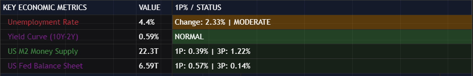
Unemployment Rate
What It Measures: The percentage of the labor force that is unemployed and actively seeking work.
Why It Matters: The unemployment rate is the most widely watched labor market indicator and directly affects consumer confidence and spending capacity.
Status Classification:
- LOW: Below 4%-tight labor market
- MODERATE: 4-5%-balanced labor market
- HIGH: Above 5%-slack in labor market
What To Watch For:
- The unemployment rate is a lagging indicator-it rises after recession begins
- Rapid increases in unemployment are more concerning than absolute levels
- The rate is used in the Sahm Rule calculation
- A rising unemployment rate from cyclical lows is a classic late-cycle warning sign
Yield Curve (10Y-2Y)
What It Measures: The difference between the 10-year Treasury yield and the 2-year Treasury yield.
Why It Matters: The yield curve is one of the most reliable recession predictors. An inverted yield curve (negative spread) has preceded every US recession since 1955, with only one false signal. This is critical to remember and definitely one of our favorite models.
Status Classification:
- NORMAL: Positive spread above 0.5%-longer-term rates are higher than shorter-term rates
- FLAT: Spread between 0% and 0.5%-curve is flattening, often a warning sign
- INVERTED: Negative spread historically precedes recessions by 6-18 months
What To Watch For:
- Inversion itself is a warning, but the signal often comes when the curve un-inverts
- The period AFTER inversion, when the curve steepens, has historically been the danger zone
- The MRS specifically tracks whether the curve was inverted 12 months ago but is now positive
- Duration of inversion matters-longer inversions historically precede more severe recessions
US M2 Money Supply
What It Measures: The total money supply, including cash, checking deposits, and easily convertible near-money.
Why It Matters: Money supply growth influences both economic activity and inflation. Contracting the money supply is rare and historically associated with severe economic stress.
What To Watch For:
- Rapid M2 growth can fuel asset bubbles and inflation
- M2 contraction is extremely rare and concerning when it occurs
- Compare M2 growth to GDP growth for inflation implications
- The Fed’s monetary policy directly influences M2
US Fed Balance Sheet
What It Measures: Total assets held by the Federal Reserve, primarily Treasury securities and mortgage-backed securities.
Why It Matters: Fed balance sheet expansion (quantitative easing) adds liquidity to financial markets; contraction (quantitative tightening) removes liquidity.
What To Watch For:
- Balance sheet expansion typically supports risk assets
- Balance sheet contraction can pressure both bond and equity markets
- The pace of change matters as much as the direction
- Compare to market conditions – QT during market stress can amplify problems
8. Delinquencies and Debt
This section tracks the percentage of loans that are delinquent (past due) across various loan categories. Rising delinquencies are early warning signs of economic stress.
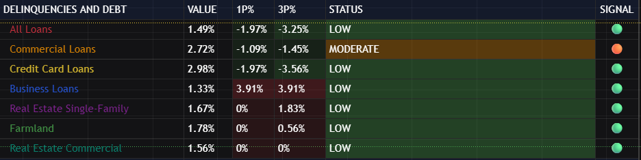
Understanding Delinquency Data
Delinquency rates are reported as a percentage of total loans in each category. These are quarterly figures from the Federal Reserve’s banking statistics.
All Loans
What It Measures: The delinquency rate across all loan categories-a comprehensive measure of credit stress.
Risk Levels:
- LOW: Below 2%
- MODERATE: 2-3%
- HIGH RISK: Above 3%
What To Watch For:
- This aggregate measure smooths out sector-specific fluctuations
- Rising trends are more important than absolute levels
- Compare to historical peaks during 2008-2009 and 2020 for context
Commercial Loans
What It Measures: Delinquency rate on commercial and industrial loans to businesses.
Risk Levels:
- LOW: Below 2.5%
- MODERATE: 2.5-4%
- HIGH RISK: Above 4%
What To Watch For:
- Business loan delinquencies often rise before consumer delinquencies
- The sector indicates corporate financial health and cash flow stress
- Rising rates may precede layoffs and reduced business investment
Credit Card Loans
What It Measures: Delinquency rate on credit card debt.
Risk Levels:
- LOW: Below 3%
- MODERATE: 3-5%
- HIGH RISK: Above 5%
What To Watch For:
- Credit cards are typically the first debt consumers stop paying when stressed
- Higher baseline rates than other loan categories-focus on trends
- Rising credit card delinquencies indicate consumer financial stress
Business Loans
What It Measures: Broader business loan delinquencies beyond commercial and industrial.
Risk Levels:
- LOW: Below 1.5%
- MODERATE: 1.5-2%
- HIGH RISK: Above 2%
What To Watch For:
- Small business stress often appears here first
- Compare trends to commercial loans for a fuller picture
- Rising rates may indicate tightening credit conditions
Real Estate Single-Family
What It Measures: Delinquency rate on single-family residential mortgage loans.
Risk Levels:
- LOW: Below 2%
- MODERATE: 2-3%
- HIGH RISK: Above 3%
What To Watch For:
- Housing is typically the largest household expense-delinquencies here indicate severe stress
- 2008 crisis was driven in part by single-family mortgage delinquencies
- Rising rates may indicate housing market stress or household financial deterioration
Farmland
What It Measures: Delinquency rate on agricultural real estate loans.
Risk Levels:
- LOW: Below 2%
- MODERATE: 2-3%
- HIGH RISK: Above 3%
What To Watch For:
- Agricultural sector is sensitive to commodity prices and weather
- May provide early warning of rural economic stress
- Generally more volatile than urban real estate categories
Real Estate Commercial
What It Measures: Delinquency rate on commercial real estate loans (excluding farm and construction).
Risk Levels:
- LOW: Below 2.5%
- MODERATE: 2.5-4%
- HIGH RISK: Above 4%
What To Watch For:
- Commercial real estate cycles often lag residential cycles
- Post-pandemic work-from-home trends have structurally impacted office real estate
- Rising CRE delinquencies can stress regional bank balance sheets
Important Note on Delinquency Colors
For delinquency metrics, the color coding is INVERTED from other metrics:
- Increasing delinquencies are BAD (shown in red/orange)
- Decreasing delinquencies are GOOD (shown in green)
This ensures intuitive interpretation-red always means concern, green always means healthy. This may be confusing at first, but it’s self-explanatory after some practice.
9. Recession Risk Assessment Methods
The MRS calculates recession risk using six distinct methodologies, each capturing different aspects of economic stress. Understanding each methodology helps interpret each method’s signals appropriately.
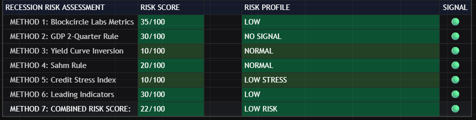
You can adjust which ones are displayed by enabling/disabling them in the Inputs tab, and you can adjust the exact look and style in the Style tab
METHOD 1: Blockcircle Labs Metrics
What It Measures: A weighted composite of the primary indicators used by the Blockcircle Labs team to assess economic conditions.
Component Categories (general structure):
- Output metrics (GDP, GDI)
- Employment metrics (payrolls, civilian employment)
- Income and consumption metrics
- Industrial production
- Credit stress indicators
When It’s Most Useful: This methodology provides the most comprehensive ongoing assessment of economic conditions. It’s less prone to false signals than single-indicator methods.
What To Watch For:
- Gradually rising scores indicate deteriorating conditions
- Scores above 40 warrant attention
- Scores above 60 indicate significant economic stress
- Scores above 80 suggest recession conditions may be present or imminent
METHOD 2: GDP 2-Quarter Rule
What It Measures: Whether GDP has declined for two consecutive quarters, the commonly cited (though not official) definition of recession.
Risk Profiles:
- NO SIGNAL: GDP growing or only one quarter of decline
- WARNING: One quarter of decline
- RECESSION SIGNAL: Two consecutive quarters of decline
When It’s Most Useful: This simple rule provides a clear, objective signal based on the most widely watched economic indicator.
What To Watch For:
- This is a lagging indicator-by the time it triggers, recession may already be underway
- Not all economic contractions meet this definition (the 2001 recession didn’t)
- Best used in conjunction with other methods rather than in isolation
METHOD 3: Yield Curve Inversion
What It Measures: The status of the 10-year minus 2-year Treasury yield spread, with particular attention to inversion and subsequent un-inversion.
Risk Profiles:
- NORMAL: Positive spread, no recent inversion history
- INVERTED: Currently inverted
- UNINVERTED – HIGH RISK: Was inverted 12 months ago but has now un-inverted
When It’s Most Useful: This is the best long-lead indicator, often signaling recession 6-18 months before it occurs.
What To Watch For:
- The danger period is often when the curve STEEPENS after being inverted
- Un-inversion frequently occurs as the Fed cuts rates in response to weakening conditions, this is when you see it shift > 0
- The timing from un-inversion to recession is variable, but historically meaningful because usually we experience a recession 6-18 months after it un-inverts
METHOD 4: Sahm Rule
What It Measures: Whether the 3-month average unemployment rate has risen by 0.5 percentage points or more from its low of the previous 12 months.
Risk Profiles:
- NORMAL: Indicator below 0.1
- ELEVATED: Indicator between 0.3 and 0.4
- NEAR TRIGGER: Indicator between 0.4 and 0.5
- TRIGGERED: Indicator at or above 0.5
When It’s Most Useful: The Sahm Rule is one of the most reliable real-time recession indicators, developed specifically to identify recessions as they begin.
What To Watch For:
- This rule has triggered at the start of every recession since 1970
- Once triggered, recession is typically already underway
- Watch for rising readings even before the 0.5 threshold is reached
- The indicator rising from 0.2 to 0.4 is itself a warning sign
METHOD 5: Credit Stress Index
What It Measures: A composite of delinquency rates and their acceleration across multiple loan categories.
Risk Profiles:
- LOW STRESS: Delinquencies contained, not accelerating
- MODERATE: Some elevation in delinquencies
- HIGH STRESS: Multiple delinquency categories elevated
- SEVERE STRESS: Widespread elevated and accelerating delinquencies
When It’s Most Useful: Credit stress often precedes economic stress, as households and businesses typically struggle with debt payments before broader economic statistics reflect problems.
What To Watch For:
- Acceleration (delinquencies rising faster) is often more important than absolute levels
- Credit stress can precede official recession by several quarters
- Watch for stress spreading across multiple categories
METHOD 6: Leading Indicators
What It Measures: A composite of forward-looking indicators, including yield curve, money supply changes, industrial momentum, market volatility, real interest rates, and labor market tightness.
Risk Profiles:
- LOW: Most leading indicators are positive
- MODERATE: Mixed signals
- ELEVATED: Multiple indicators showing concern
- HIGH RISK: Most indicators are negative
When It’s Most Useful: This methodology seeks to anticipate economic turns before they occur by focusing exclusively on indicators that have historically led the business cycle.
What To Watch For:
- Leading indicators can give false signals during unusual economic periods
- Most valuable when multiple leading indicators align in the same direction
- Useful for portfolio positioning ahead of expected turning points
Combined Risk Score
What It Measures: A weighted average of all six methodologies.
Weighting Logic: Each methodology is weighted based on its historical reliability and timeliness, with higher weights given to methods with stronger predictive track records.
Risk Levels:
- MINIMAL RISK (0-19): Economic conditions appear healthy across all methodologies
- LOW RISK (20-39): Some indicators showing concern, but no consensus
- MODERATE RISK (40-59): Multiple methodologies indicate elevated risk
- HIGH RISK (60-79): Most methodologies indicate significant risk
- SEVERE RISK (80-100): Near consensus across methodologies of recession conditions
What To Watch For:
- The combined score smooths out noise from individual methodologies
- Sustained readings above 60 warrant defensive positioning
- Declining scores from elevated levels may indicate early recovery
- Use individual methodology scores to understand what’s driving the combined reading
10. Understanding the Signal System
The MRS uses a consistent color-coded system throughout the scorecard:
For Growth Metrics (GDP, Employment, Income, etc.):
- Green Background: Positive change, healthy growth
- Yellow/Lime Background: Modest positive change
- Orange Background: Negative change, concerning
- Red Background: Significant negative change, warning
For Risk Scores:
- Green (0-19): Minimal risk
- Lime (20-39): Low risk
- Yellow (40-59): Moderate risk
- Orange (60-79): High risk
- Red (80-100): Severe risk
For Delinquencies (Inverted Interpretation):
- Green: Low delinquencies, improving trends
- Orange: Moderate delinquencies
- Red: High delinquencies, deteriorating trends
Signal Emojis:
- Green Circle: Positive/Healthy
- Yellow Circle: Caution/Mixed
- Orange Circle: Concern
- Red Circle: Warning/Stress
- White Circle: Data unavailable
11. Chart Display Options
Plotting Risk Scores
Enable individual risk methodology plots to visualize trends over time:
- Plot METHOD 1: Blockcircle Labs Metrics: Blue line
- Plot METHOD 2: GDP 2-Quarter Rule: Red line
- Plot METHOD 3: Yield Curve Risk: Orange line
- Plot METHOD 4: Sahm Rule: Purple line
- Plot METHOD 5: Credit Stress: Yellow line
- Plot METHOD 6: Leading Indicators: Teal line
- Plot Combined Risk Score: White line
Plotting Economic Metrics
Enable plots of underlying economic data (scaled for visibility):
- Real GDP
- Real GDI
- Real Personal Income
- Real Personal Consumption
- Employment Level
- Industrial Production
Risk Threshold Lines
The chart displays horizontal reference lines at your configured thresholds:
- Severe Risk (default 80)
- High Risk (default 60)
- Moderate Risk (default 40)
- Low Risk (default 20)
Moving Average Smoothing
Enable smoothing to reduce noise in plotted risk scores:
- Use Moving Average Smoothing: Toggle on/off
- MA Type: SMA, EMA, WMA, or RMA
- Short MA Length: Number of periods for smoothing (default 3)
12. Alert Configuration
The MRS includes a comprehensive alert system to notify you of changing conditions.
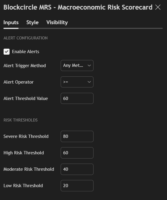
Enable Alerts
Toggle the alert system on or off.
Alert Trigger Method
Choose which methodology triggers alerts:
- METHOD 1 Only through METHOD 6 Only: Alerts only on specific methodology
- Any Method: Alerts when ANY methodology meets the condition
- All Methods: Alerts only when ALL methodologies meet the condition
- Combined Score: Alerts based on the combined risk score
Alert Operator
Select the comparison logic:
- >: Greater than threshold
- >=: Greater than or equal to threshold
- ==: Equal to threshold
- <=: Less than or equal to threshold
- <: Less than threshold
Alert Threshold Value
Set the risk score value for comparison (0-100).
Example Alert Configurations:
Early Warning Setup:
- Method: Combined Score
- Operator: >=
- Threshold: 50
Confirmation Setup:
- Method: All Methods
- Operator: >=
- Threshold: 60
Leading Indicator Focus:
- Method: METHOD 6 Only
- Operator: >=
- Threshold: 60
13. Practical Applications
For Long-Term Investors
Regime Assessment: Use the Combined Risk Score as a regime indicator:
- Scores below 40: Economic expansion likely favors growth assets
- Scores 40-60: Increased uncertainty-consider rebalancing to more defensive positions
- Scores above 60: Elevated recession risk-consider reducing risk asset exposure
Timing Considerations: Economic indicators are slow-moving. Check the scorecard weekly or monthly rather than daily. Focus on trends over time rather than single readings.
For Active Traders
Risk Management: Adjust position sizing based on macroeconomic risk:
- Lower risk scores support larger position sizes and longer holding periods
- Higher risk scores warrant smaller positions and tighter risk management
Sector Rotation: Use individual metrics to inform sector allocation:
- Rising delinquencies: Underweight financials, consumer discretionary
- Weak industrial production: Underweight industrials, materials
- Tight labor market: Watch for margin pressure in labor-intensive sectors
For All Market Participants
Narrative Verification: When financial media promotes a particular economic narrative, verify it against the MRS:
- “Soft landing” claims should show declining risk scores
- “Recession imminent” claims should show elevated scores across multiple methodologies
- “Economy is strong” claims should show healthy Core Recession Metrics
Decision Framework: Establish your own thresholds for action:
- Define what the Combined Risk Score triggers your defensive positioning
- Define what Core Recession Metric trends concern you
- Document your plan when conditions are calm so you can execute rationally during stress
14. Frequently Asked Questions (FAQ)
Q: How often is the data updated? A: Data updates vary by source: GDP and GDI are quarterly, most employment and income data is monthly, yield curve data is daily. The MRS automatically pulls the latest available data.
Q: Can I use the MRS for non-US markets? A: The MRS is calibrated for the US economy. While US conditions influence global markets, the specific metrics are US-focused. Global investors should consider US conditions as one input among many.
Q: Why do some values show “N/A”? A: Data may be temporarily unavailable due to release schedules, data provider issues, or TradingView connection status. Most N/A values resolve automatically.
Q: How should I interpret divergence between different risk methodologies? A: Divergence is common and informative. Leading indicators may rise before lagging indicators. Credit stress may appear before employment weakness. Use divergence to understand which parts of the economy are showing stress first.
Q: What’s the difference between the period columns (1P%, 3P%, etc.)? A: These show the percentage change from the current value to the value from that many periods ago. For monthly data, 3P is 3 months; for quarterly data, 3P is 3 quarters. Multiple timeframes help distinguish noise from trend.
Q: Should I act immediately when risk scores rise? A: Economic indicators are slow-moving and noisy. Single readings are less meaningful than sustained trends. Establish thresholds in advance and focus on sustained moves above those thresholds rather than reacting to every fluctuation.
Q: Why might the GDP 2-Quarter Rule show “NO SIGNAL” even when other methods show elevated risk? A: The GDP 2-Quarter Rule requires actual GDP contraction, which is a lagging indicator. Other methods may detect developing weakness before GDP turns negative. This is the value of multiple methodologies.
Q: How does the MRS handle data revisions? A: Global economic data is frequently revised. The MRS automatically uses the latest available data, which includes any revisions. Historical analysis should account for the fact that real-time readings may differ from subsequently revised values, this is especially true with balance sheets, money supplies, etc and you could see this more concretely when there are government shutdowns like there just was in 2018 and 2025.
"Member since 2018. The real value is in the Discord and the market data. Basel and Hunter provide a perfect blend of expertise."
"Best subscription I've ever had. High ROI. Phenomenal community. Founders are top 1% in vision and innovation."
"No team better than Blockcircle. The alpha you get here you cannot find anywhere else."
"Basel and Hunter are godsends for anyone trying to navigate the crypto space."
"Best crypto group. I can't believe the guys who run this are so transparent and helpful."