Sort a launch feed by market cap and the top of the list can read like a venture round. Enormous headline caps on tokens that were deployed this week. Then look one column across at liquidity and the same rows are sitting on pool depth you could clear with a credit card. That gap is not a data error. It is the most reliable single tell I have for separating a launch with a real float from one where the headline number was printed rather than paid for.
The Alpha Hunter Suite launches feed scores every fresh token on holders, liquidity, market cap and safety flags. Most people read those one at a time, which is where the mistake starts. Market cap on a day-old token is a derived number. Liquidity is a deposited one. The ratio between something derived and something deposited tells you which of the two is lying, and on new launches it is almost always the derived one.
Why a day-zero market cap is arithmetic, not money
Market cap is supply multiplied by the price of the last trade. On a token that has existed for six hours, both of those inputs are under the deployer's control. Supply is whatever number went into the contract. The last trade price is whatever the seeding transaction set, and a seeding transaction can be a few thousand dollars of paired asset against a deliberately tiny circulating float.
Work the arithmetic on a launch quoted at one billion in market cap with sixty thousand dollars of liquidity. Nobody deposited a billion dollars. In a standard two-sided pool, sixty thousand of headline liquidity means roughly thirty thousand of paired asset, and that thirty thousand is the entire pot of real money available to every holder who ever wants out. The cap is sixteen thousand times the pool. Stated the other way, real money in the pool is six thousandths of one percent of the quoted valuation.
Nothing about that combination is illegal or even unusual. It is what happens mechanically when supply is large and the seed is small. What it does mean is that the market cap column is carrying no information about the size of the opportunity, so if you were about to size a position off it, you were sizing off nothing.
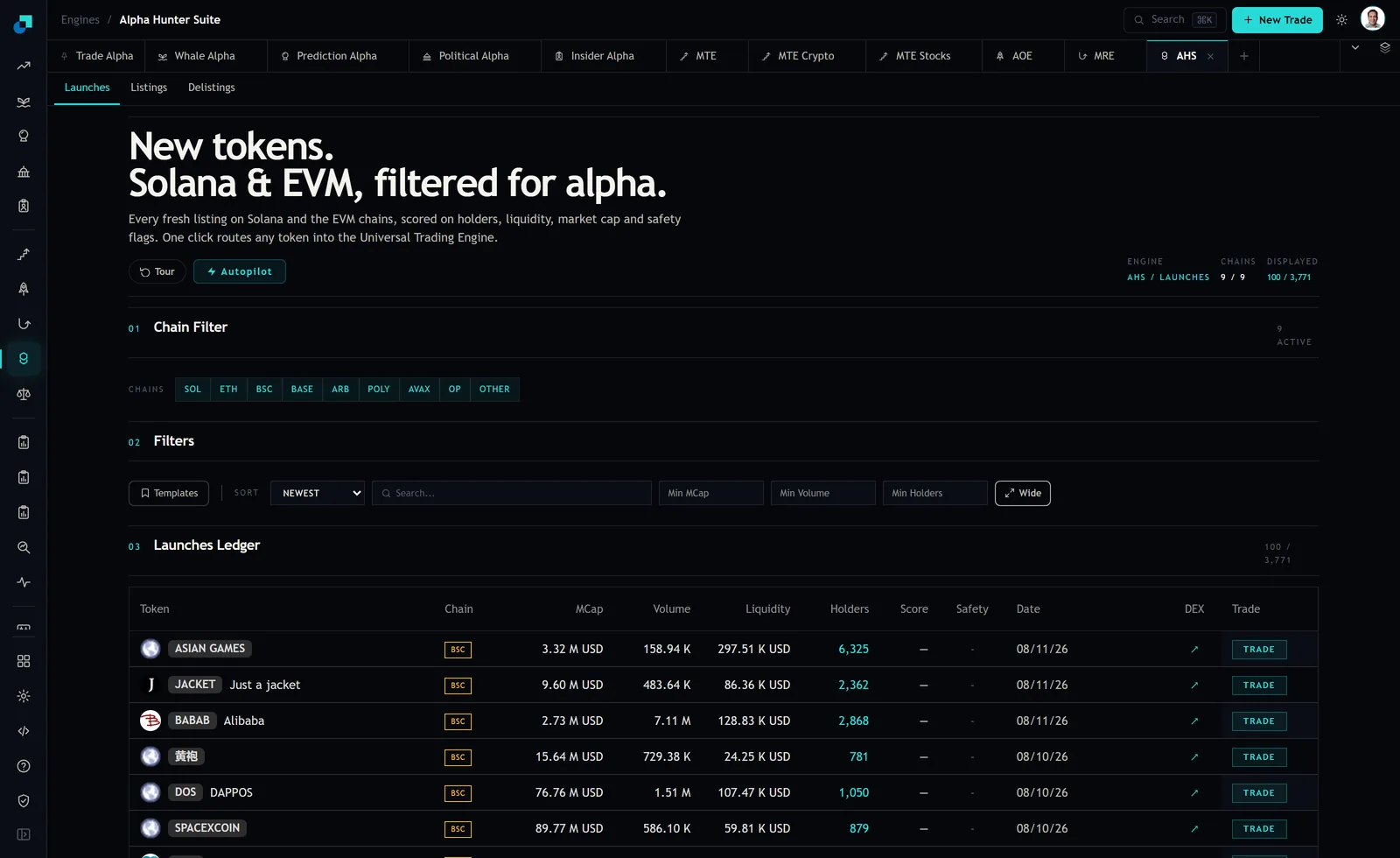
The screenshot above shows the state I actually work from. Every chain switched on, the ledger showing a hundred rows out of 3,771, sorted newest. Reading 3,771 rows by hand is not a plan. Reading one derived column against one deposited column, on a hundred rows at a time, is.
The bands I use on the ratio
I express it as liquidity divided by market cap, as a percentage, because that keeps the number in a range I can hold in my head. Four bands, and I treat them as different assets rather than as a scale.
- Above roughly five percent. The float behaves like a real one. Reasonably healthy small caps have historically carried DEX liquidity somewhere in the mid single digits of their cap, so this is the normal zone, not the exceptional one.
- Roughly one to five percent. Tradable but thin. The cap is still informative, but I size against the pool rather than the cap, and I assume the exit is worse than the entry.
- Roughly a tenth of a percent to one percent. The cap is decorative. I will still take these, but only at a size I would be willing to write off entirely, because the quoted price is real for trade sizes near zero and my size is not near zero.
- Below a tenth of a percent. The billion-on-sixty-thousand case sits here. I do not treat the cap as a valuation at all. The only number on the row with any claim to being real is the liquidity figure itself.
Two things make those bands more useful than they look. The first is that they are stable across chains. A Solana launch and a Base launch with the same ratio have roughly the same exit problem, even though the raw dollar figures and the gas costs are nothing alike. The second is that the ratio moves fast in one specific direction. A launch that starts in band two and slides to band four over a day has not gained market cap by being discovered. It has usually lost pool depth, and losing pool depth means somebody withdrew.
The version of this check that costs you money
The failure mode is not reading the ratio wrong. It is reading it once. A ratio is a snapshot of two numbers that change on different clocks, and the pool side changes faster and with far less warning.
So I check it twice on anything I actually intend to buy, separated by whatever gap is practical, and I care much more about the direction than the level. Liquidity climbing while cap climbs is a token attracting capital. Cap climbing while liquidity sits flat is a token attracting price. Cap climbing while liquidity falls is the pattern I have no interest in owning, whatever the safety flags on the row say, because the person best informed about this token has decided to have less money in it than they had this morning.
The second cost is subtler. A very high ratio is not automatically good. A token with liquidity at forty percent of its market cap is usually not a well-capitalised launch. It is a launch where the cap collapsed and the pool has not been pulled yet, or one where the paired-asset side is doing something unusual. When the ratio looks too good, the thing to check is which direction it got there from.
What the ratio cannot tell you
This check answers exactly one question, and it is worth being precise about which. It tells you whether the headline valuation is backed by deposited money. It does not tell you whether the pool will still be there in an hour.
Liquidity that is deposited can be withdrawn. A pool of two million dollars behind a twenty million cap is a healthy band-one ratio right up until the wallet that provided it removes the position, at which point the same token is a band-four token with a chart that has not caught up yet. The ratio is a measure of the current state of the pool, not a lock on it, and the launches feed carries safety flags precisely because that is a separate question from depth.
It also says nothing about who holds the supply. A perfectly respectable ratio on a token where a handful of wallets hold most of the float describes a market that can be walked down by one participant without any liquidity being withdrawn at all. Ratio and concentration are independent failure modes and the feed gives you holders as its own column for that reason.
Running it as the first cut, not the last
In practice this is the cheapest filter available, so it goes first. My order is to leave all chains on, sort by market cap to pull the large headline numbers to the top, and read down the liquidity figures next to them. The rows where the two numbers are wildly out of proportion are the ones the sort order has just done me the favour of collecting in one place. Sorting by the biggest number is normally a way to find hype. Here it is a way to find arithmetic artifacts, because the most inflated caps and the emptiest pools are the same rows.
Then invert it. Sort by market cap ascending and look for the opposite shape, small caps carrying disproportionate depth. That set is much shorter and it is the more interesting half, because a launch where somebody has put real paired asset behind a modest valuation has told you something about their intentions that no announcement could.
Everything after that cut is the slower work: holders, contract age, safety flags, the shape of the first hours of volume. But those checks take minutes each, and the ratio takes seconds, so doing them in the wrong order means spending an afternoon researching tokens whose market caps were never real to begin with. Price the float before you research the story.