Two columns on the same row, both showing a percentage, both coloured red or green, and they are measuring completely different things. Unrealized profit is priced from your entry. The 24 hour change is priced from where the asset was a day ago. One is a verdict on a decision you made, the other is a description of the last trading session, and the reason it matters is that people read whichever one is redder and act on it.
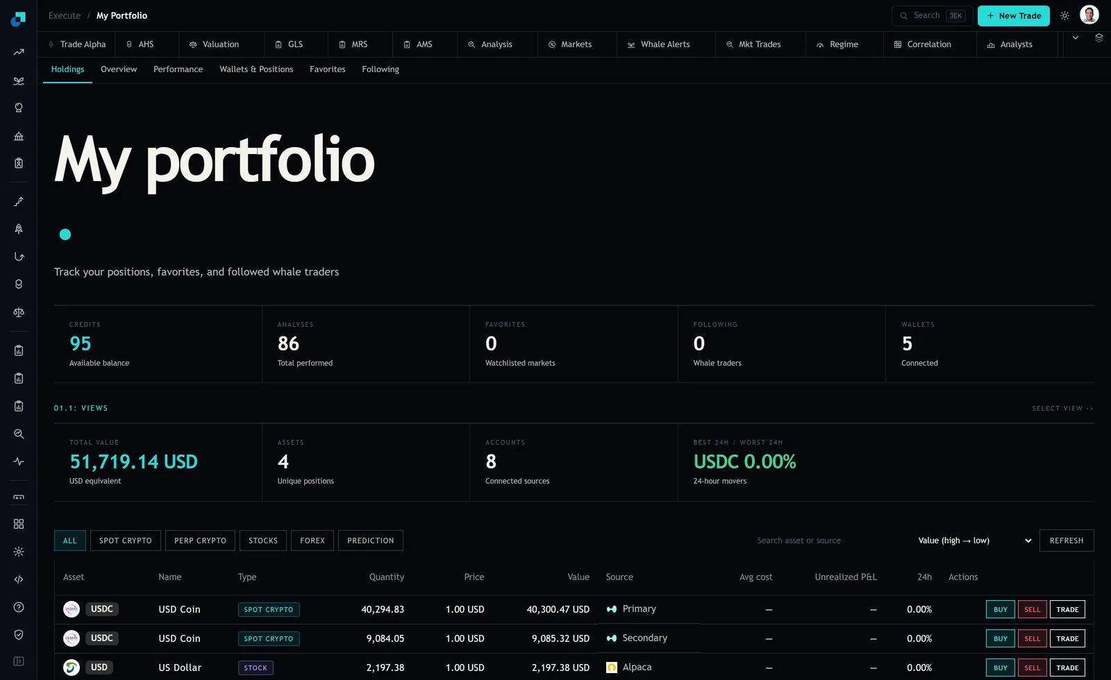
The tile strip makes the distinction concrete before you even reach the table. On the account in the capture, the BEST 24H and WORST 24H tile shows USDC at 0.00 percent. The same ticker is filling both the best and worst slot, at a change of nothing, which is what happens when a book is heavy in an asset that is not supposed to move. Not one word of that tells you whether the account is up or down on what it paid.
Two clocks, two starting prices
Unrealized profit starts its clock on the day you bought. It compounds every decision since, including the ones where you added to a position or averaged down, and it answers a single question: was buying this, at that price, in that size, a good idea so far. It is a slow number. It should move slowly, and if you are checking it hourly you are asking a long horizon question at a short horizon frequency.
The 24 hour change starts its clock roughly a day ago and knows nothing about you. It is the same number for the person who bought yesterday and the person who has held for three years. It answers what the market did to this asset recently, which is a question about the market, not about your book.
Worth establishing on your own screen, once, is exactly what window the 24 hour figure uses. A rolling 24 hours from the current moment and a change measured from a session or daily close are both normal conventions, and they can differ by a lot on a day with a sharp overnight move. The way to settle it is not to guess. Note the value, wait a known interval such as an hour, and note it again. A rolling window shifts continuously as old prices drop out of the back of it. A close based figure holds its reference point until the next close. Ten minutes of watching tells you which one you have, and then every future reading means something specific.
The exit that conflating them produces
The failure mode is specific and I have done it myself. You hold a position that is up 60 percent from entry. It has a bad day and prints minus 9 percent in the 24 hour column. Your eye lands on the red, your stomach reacts to the red, and you sell. What actually happened is that a position you are heavily up on gave back a small part of a large gain, which is the most ordinary event in markets.
The mirror image is worse. A position you are down 35 percent on prints plus 4 percent for the day, the row goes green, and it feels like the thesis is recovering. A 4 percent bounce inside a 35 percent hole is noise. Nothing has been recovered. That green cell has repeatedly talked people out of exits they had already decided were correct.
Both mistakes come from the same root, which is letting a column choose the question. The columns do not know what you are trying to decide. You have to bring the question and then read the column that answers it.
Which column belongs in which decision
The mapping is not complicated once it is written down.
- Should I still own this. Unrealized profit is barely relevant here and the 24 hour figure is completely irrelevant. This is a question about the asset and your original reason for holding it. The correct input is whether that reason still holds, not either column.
- Am I too big in this. Value as a share of the book total, which reads 51,715.70 in the capture. Neither profit column enters into it. A position that has run is a bigger position, and that is the whole risk.
- Was my entry good. Unrealized profit, read across your last ten or twenty entries rather than on one row. One winner tells you nothing about your process. A pattern across twenty tells you a lot.
- Is something happening right now. The 24 hour figure, and only as a prompt to go and look at news or the order book. It is an alert, not an instruction.
- Should I take some off. Both, plus the thing neither shows, which is your plan from before you entered.
The arithmetic on a 4,000 dollar position
Numbers make this easier to hold onto. Say you own 4,000 dollars of a token, bought at an average of 2.50 with the price now at 4.00. Unrealized profit is 60 percent, which in dollars is 1,500 on a 2,500 dollar cost. The 24 hour column reads minus 9 percent, which is 396 dollars off today's value.
Selling the whole position on the strength of that red cell realises 1,500 in gain and takes you completely out of an asset your own analysis said was worth owning, on the evidence of one session. If your plan was to trim at a double, you are not there. If your plan was to hold for a year, one day is 0.3 percent of the holding period. The only version where selling is right is the one where the reason you bought has broken, and the 24 hour column cannot see that reason.
Run the same arithmetic in reverse for the losing case. A 4,000 dollar position down 35 percent has cost you around 2,150 against a cost of 6,150. A 4 percent up day returns 160 of that. To get back to your entry the asset has to gain 54 percent from here, which is a completely different proposition to a 4 percent bounce, and it is the number you should be looking at when you decide whether to keep waiting.
A weekly review that uses both columns properly
What I do, and what I suggest to anyone running their own book, is read the two columns at different frequencies on purpose.
Once a week, in a quiet moment, read the profit column across every row. Ask of each position whether the reason you own it is still true and whether it has grown into a size you did not choose. That review produces at most one or two actions, and they are usually trims rather than exits. Positions get trimmed because they became large, not because they became green.
The 24 hour column gets read only when you are already at the screen for another reason, and it gets treated as a pointer. A double digit move in either direction on something you own is worth thirty seconds of finding out why. Everything smaller is the market breathing. On the account in the capture, with the best and worst mover both sitting at 0.00 percent, there would be nothing to look at at all, and that is a perfectly good outcome for a Tuesday.