Rebalance intervals are usually inherited rather than chosen. A desk runs monthly because the last strategy ran monthly, or it runs at the signal's native cadence because that is what the vendor refreshes at. Both are guesses about the persistence of the signal, and both are testable. For a relative strength ranking like the Asset Outperformer Engine, which rescans its full universe every six hours, the gap between the refresh rate and the defensible rebalance rate can be enormous, and the only way to know is to measure the decay yourself.
Two decay questions that answer differently
The first thing to separate is what is decaying, because there are two distinct quantities and conflating them produces a rebalance interval that is wrong in an unpredictable direction.
Rank persistence asks how long a name that is in the top decile today remains in the top decile. It is a question about the stability of the classification. Excess return decay asks how much outperformance a name delivers in week one after selection versus week two, week three and so on. It is a question about the economics.
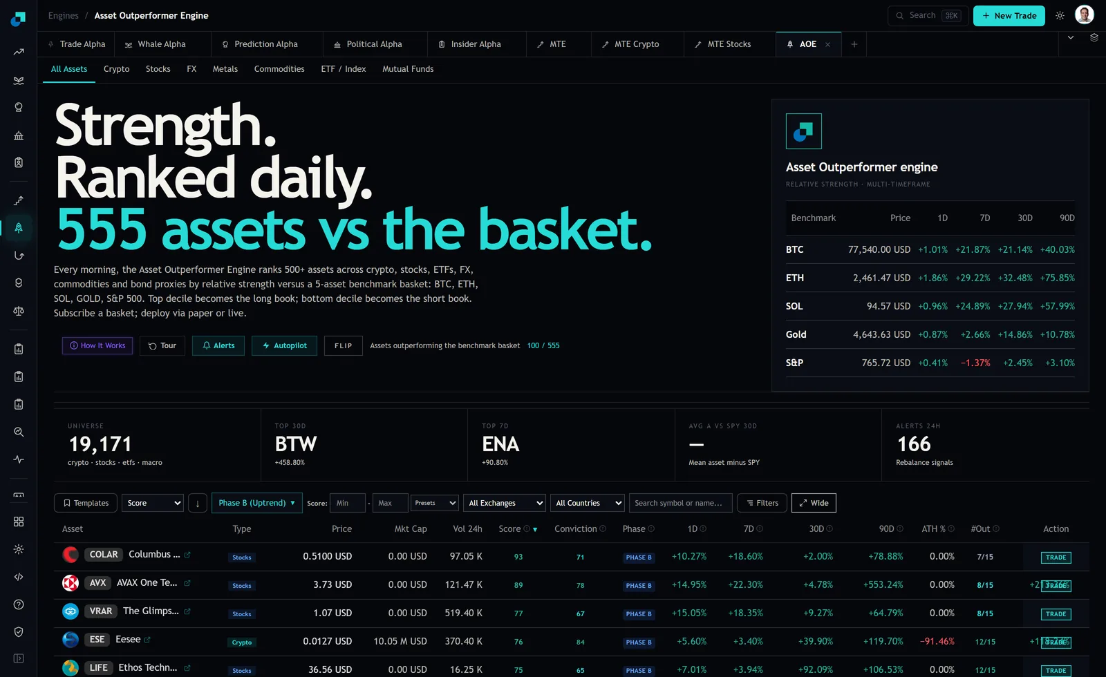
These come apart routinely, and both directions are informative. A name can hold its decile position for months while the excess return it generates goes to zero, which describes a crowded signal that is still correctly identifying quality but no longer being paid for it. Conversely, excess return can persist while decile membership churns violently, which usually means the boundary is noisy rather than the signal weak. That second case is common here: on the captured board, six US stocks shared a score of exactly 70 and the crypto tab held five names at 69 and five at 68. When ties are that dense, decile membership will oscillate for reasons unrelated to anything economic.
Designing the persistence study
The mechanics are unglamorous and the discipline is in the details that make it honest.
Form cohorts on a fixed schedule, weekly is usually enough, by recording the full decile membership at a stated scan timestamp. Then observe each cohort at fixed intervals afterwards and record the fraction still in the decile. Plot the survival curve and read the point where half the cohort has left. That figure, in weeks, is your rank half-life.
Four requirements make the result usable rather than decorative. Fix the population before you start: run the study inside a single type tab rather than across the combined board, because crypto, US equities and ETFs have different volatilities and blending them produces a half-life that describes nothing. Fix the scan timestamp so that formation and observation always occur at the same point in the six-hour cycle, otherwise you are measuring the scan boundary as much as the signal. Handle exits explicitly, deciding in advance whether a name that leaves the universe entirely counts as a decile departure or is censored. And record ties at the boundary separately, so that the curve can be recomputed with a buffer applied and the difference attributed.
Run the same study with a buffer, meaning membership is retained until the name falls past a wider exit threshold. The gap between the two curves is the portion of your measured decay that is boundary noise rather than signal decay, and it is usually larger than people expect.
The excess return study and its benchmark trap
The second study takes the same cohorts and measures return rather than membership, bucketed by weeks since selection. Week one excess return, week two, week three, out to whatever horizon your rebalance discussion actually covers. What you want is the shape of the fade and the point at which the bucket means are no longer distinguishable from zero given your sample.
The trap is the benchmark, and it is fatal if you get it wrong. The engine scores assets against a specific five-asset basket, Bitcoin, Ethereum, Solana, Gold and the S&P 500, across three timeframes. If you measure excess return against something else, a single equity index or an absolute return threshold, you are not measuring the decay of this signal. You are measuring the decay of this signal plus the drift between two different benchmarks, and in a period where those diverge sharply the second term will dominate.
How sharply is worth seeing. On the captured benchmark strip, ETH showed +32.48% over 30 days and +75.85% over 90, while the S&P line showed +2.45% and +3.10%, with 7-day S&P at -1.37%. A decay curve computed against SPY and a decay curve computed against the full basket would tell you materially different stories over that stretch, and only one of them is about the signal.
Note also that the module's own summary tile reports average alpha against SPY over 30 days, described as the mean asset minus SPY. That is a useful headline number and it is not the basket. Do not let it stand in for the study.
Reading the two curves against a rebalance interval
With both curves in hand the decision becomes arithmetic rather than preference. The rebalance interval wants to sit inside the excess return half-life, since rebalancing after the return has faded means paying costs to rotate into names whose edge you have already collected. It wants to sit outside the rank half-life where possible, because rebalancing faster than the classification is stable means trading noise.
When those two constraints conflict, and they often do, the rank half-life is the one to relax, because a buffer or hysteresis rule can extend it without touching the underlying signal, whereas nothing you do to the book extends the return half-life. That asymmetry is the practical finding of the whole exercise.
The output should be a stated interval with the two half-lives beside it and a sentence on which constraint bound. Anyone reviewing the sleeve later can then see whether the interval was chosen or inherited.
The failure modes that make a half-life look longer than it is
Four of these will flatter your curves and all four are avoidable.
Survivorship is the first. Names that leave the universe between observations are not neutral, and dropping them silently biases the surviving cohort upward. Decide the censoring rule before you see any results.
Unscored rows are the second and they are specific to this module. Assets the engine cannot price show a score of 0 with dashes in the price and market cap cells, and at capture the combined board carried a block of them including tickers that scored 70 or 71 on their own type tabs. If your study reads a zero as a genuine bottom-decile score, you have injected phantom departures into every cohort and shortened the measured half-life. If it drops them without a rule, you have done the opposite.
Boundary ties are the third, discussed above, and they show up as departures that reverse immediately.
The fourth is look-ahead through the scan boundary. The engine refreshes every six hours, and a cohort formed from a scan whose timestamp you did not record may include information that was not available at the moment you would actually have traded. Record the timestamp with the cohort. It costs nothing at collection time and it is unrecoverable afterwards.