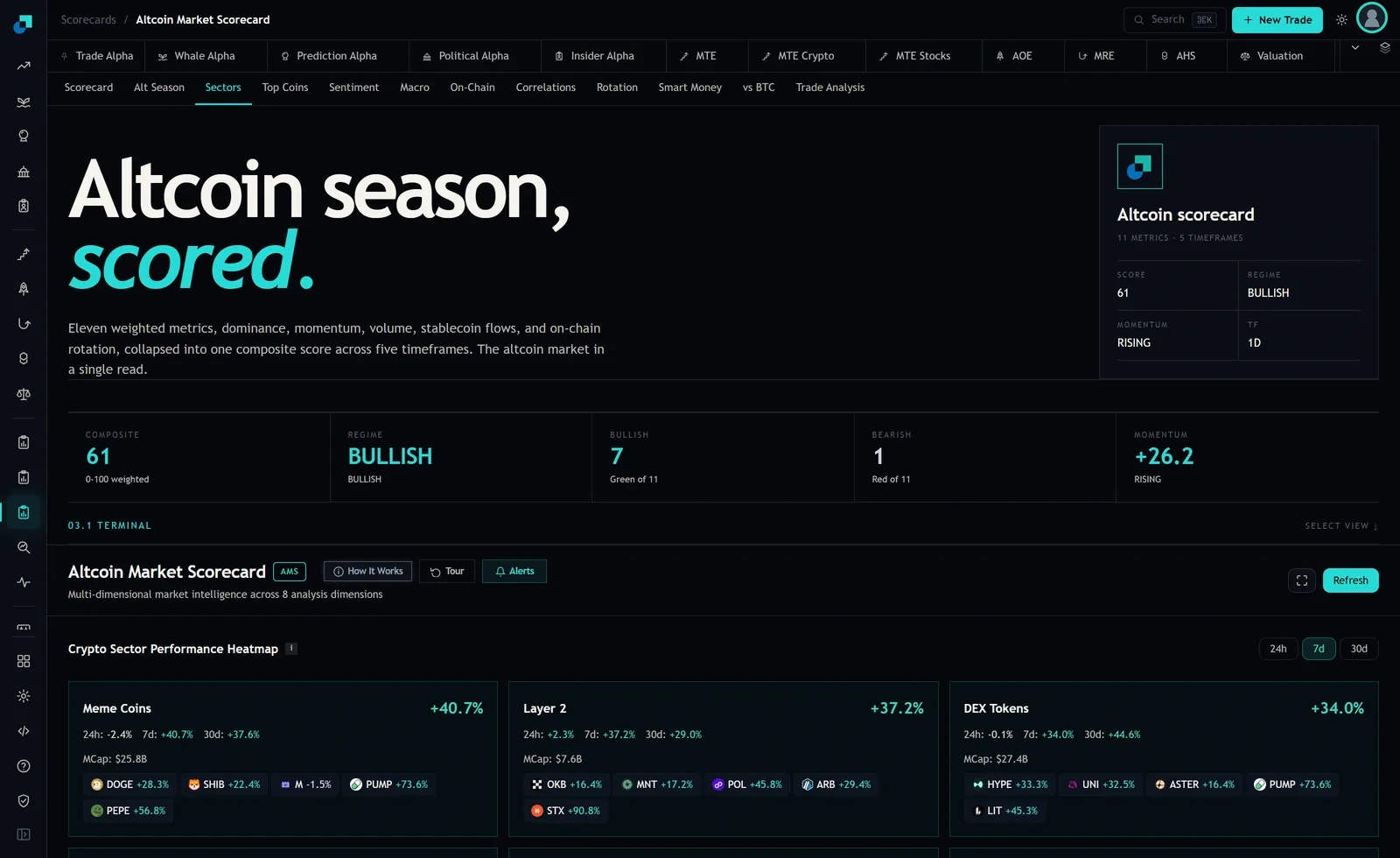
The Layer 2 card on the sector heatmap reads +37.2 percent over seven days. Underneath it the constituent chips read OKB +16.4 percent, MNT +17.2 percent, POL +45.8 percent, ARB +29.4 percent, and STX +90.8 percent. Average those five and you get +39.9 percent. Take STX out and average the other four and you get +27.2 percent.
That is a twelve point swing from removing one name out of five. The card is not lying to you. It is doing what an average does, which is to let the largest number in the set speak for the set. The job of this piece is to give you the ninety second check that tells you whether a green sector was a sector or a name, because the two of them lead to completely different decisions and they look identical on the heatmap.
The card gives you a mean and never a median
There is one number at the top of each card and it is an average of some kind. There is no median on the panel. You have to compute that yourself, and it is the fastest thing you can do with the chips because it is just the middle number when you sort them.
Do it for the three cards on screen. Meme Coins lists DOGE +28.3, SHIB +22.4, M minus 1.5, PUMP +73.6 and PEPE +56.8. Sorted, the middle is +28.3, against a mean of +35.9. Layer 2 sorted has a middle of +29.4 against a mean of +39.9. DEX Tokens lists HYPE +33.3, UNI +32.5, ASTER +16.4, PUMP +73.6 and LIT +45.3, with a middle of +33.3 against a mean of +40.2.
Every one of those means sits above its median, by 7.6, 10.5 and 6.9 points respectively. That is the signature of a right skewed set: a few large winners pulling the average up above where most of the members actually are. In all three cards, the typical member did worse than the number printed on the card.
The drop-one test
Here is the whole test. Average the chips. Remove the single best performer. Average again. Compare.
Meme Coins goes from +35.9 to +26.5 when PUMP comes out, a fall of 9.4 points. Layer 2 goes from +39.9 to +27.2 without STX, a fall of 12.7 points. DEX Tokens goes from +40.2 to +31.9 without PUMP, a fall of 8.3 points. As a fraction of the original average that is 26 percent, 32 percent and 21 percent of the sector's entire week riding on one name.
My working threshold is a third. If removing one member takes more than about a third of the average with it, I stop calling it a sector move and start calling it a name that had a week inside a bucket. Layer 2 is at that line. And notice which member it is: STX at +90.8 percent, in a bucket where two other members did not clear +18 percent. If you bought Layer 2 exposure last week by picking any of OKB, MNT or ARB, you owned the sector and you did not get the sector's number.
The small bucket is where this bites hardest
Each card also prints a combined market capitalisation, and it explains why the effect is worse in some buckets than others. Layer 2 shows 7.6 billion dollars. Meme Coins shows 25.8 billion. DEX Tokens shows 27.4 billion.
The Layer 2 bucket is roughly a third of the size of the other two. In a small bucket, one name is a bigger share of everything, so it takes less capital to move the headline and one name's week is more likely to become the bucket's week. That is exactly the pattern in the numbers: the smallest bucket on the screen also has the largest drop-one effect.
The practical version of this is that you should be more suspicious of a big percentage in a small bucket than of the same percentage in a large one. It is easier to produce, it is more likely to be one name, and it is the one you are most likely to see promoted on social media, because a small bucket that moved a lot makes better copy than a large bucket that moved a little.
The reading that tells you the green was one name
Three tells, in the order they take time to check.
The first is the drop-one number above. More than a third of the average in one member and you are looking at a name.
The second is the gap between the mean and the median. If the mean is well above the middle member, the average is not describing the typical constituent and you should not use it as an estimate of what you would have earned by picking a member at random.
The third is the count of members that beat their own card. In Meme Coins, two of the five listed chips beat +40.7 percent. In Layer 2, two of five beat +37.2 percent. In DEX Tokens, two of five beat +34.0 percent. So across all three cards, six of fifteen listed names beat their own sector's headline. A blind pick inside a green bucket had worse than even odds of keeping up with the number that made the bucket look attractive.
What the test changes about the trade
Say the drop-one test comes back clean, meaning the members are bunched and no single name carries the week. That is a real sector move, and it is the case where a bucket is a sensible unit of exposure. Spreading a fixed amount across several members is reasonable, because the members are behaving like members and the average is a fair description of what you would have got.
Say instead it comes back concentrated, as Layer 2 does at 12.7 points from STX. Now the honest framing is that you are not choosing whether to buy a sector. You are choosing between two different trades and you should say which one out loud. Trade one is buying the name that already ran, which is a momentum bet on a token that is up 90 percent in a week, with everything that implies about the price you pay and how far it can retrace before your thesis is dead. Trade two is buying the members that did not run, on the theory that the label pulls them along afterwards. That is a rotation bet, and it is a genuinely different claim about the world, one that the heatmap gives you no evidence for.
Neither trade is wrong. Confusing either of them with buying a strong sector is what costs money, because you end up sized as though you own a diversified basket while actually owning a single name's aftermath. The card will not tell you which situation you are in. Two averages and one subtraction will, and it takes less time than reading the rest of the tab.