On the same platform, on the same day, I can show you a whale win rate of 44.3 percent and a whale win rate of 12.1 percent. Both are computed correctly. Neither is a typo. And if I apply a few filters to the wallet list, I can show you a cohort average far above either of them, because that is what filters do to averages. The number changes because the population changes, and almost nobody checks which population they are looking at before they act on the figure.
This is the single most common way a whale tool gets misused. Not by people who do not understand statistics, but by busy people reading a tile that does not restate its own denominator every time you glance at it.
Three numbers, three populations
The Statistics tab, at capture, reported 26,687 total whales tracked and an average win rate of 44.3 percent. That is the widest possible denominator. It includes wallets that traded once. It includes the wallet listed there as the worst performer, sitting at zero dollars. It includes everything the platform has ever indexed across the venues it covers, which spans DEX perpetuals on Hyperliquid, GMX, Drift and dYdX, prediction market wallets on Polymarket and Opinion Trade, and early participants in Solana and EVM token launches. Twenty six thousand wallets from that many sources is not a peer group. It is a census.
The Feed tab, at the same capture, reported an average whale win rate of 12.1 percent, alongside 28 active whales and 50 transactions worth 12.5 million dollars over twenty four hours. Different denominator entirely: wallets that did something in the last day, scored on what happened in that day. A one day window on 28 wallets is a tiny sample and it is dominated by whatever the market did in those twenty four hours. It is a snapshot of a mood, not a measure of skill.
The filtered Finder view is the third case, and the one that will make you the most money or cost you the most, depending on how you read it. Set a minimum PnL, a minimum trade count, a minimum win rate, and the average across the surviving rows climbs sharply. It has to. You explicitly removed the losers from the calculation.
What a filter does to an average, mechanically
Suppose the underlying distribution really does centre near 44 percent, with a spread on either side. Filter to wallets above 80 percent and the cohort average of the survivors will land somewhere near ninety, because you selected on the exact variable you are now averaging. This is not a bug and it is not the platform flattering itself. It is what the word filter means. The displayed average is a correct description of the rows on screen and a useless description of anything else.
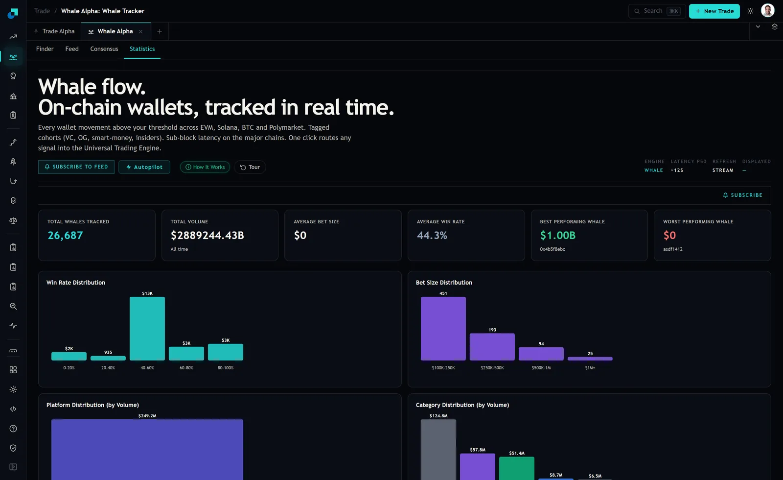
The distribution panel in that screenshot is the antidote to the whole problem. An average collapses a shape into a point. The distribution keeps the shape. When you can see that there is a real population sitting in the bottom bucket, the 44.3 percent stops feeling like a description of a typical whale and starts feeling like what it is, the balance point of a wide and lumpy spread.
The trap is not the filter, it is what you assume survived it
Here is the part that costs money. You filter to high win rate wallets, you see an impressive cohort average, and you unconsciously convert that into an expectation: if I follow these wallets, I should experience something like that number. That conversion is wrong for two separate reasons and both of them bite.
The first is that you selected on past win rate, and the future win rate of a wallet selected for past win rate is lower. Some of what got a wallet into your filtered set was skill and some was luck, and the luck component does not repeat. The gap between the filtered number and what you actually get is the size of the luck component, and you cannot see it directly.
The second is subtler and worse. Win rate is not return. A wallet that wins 90 percent of the time by taking a small profit on every trade and refusing to cut the losers has a magnificent win rate and can still be down money, because the losses are enormous and rare. Filtering on win rate specifically selects for that pathology, since it is by far the easiest way to make the number high. If you filter on win rate alone, you are not filtering for good traders. You are filtering for traders whose losses are hidden in the tail.
Which number goes in which decision
I use all three, for different things, and never interchangeably.
- The 44.3 percent census figure is my base rate. It is the answer to the question "if I picked a tracked wallet at random, what would I get". That is the bar any wallet I actually follow has to clear by enough to justify the effort. It is also the number that keeps me honest when a filtered view is making me feel clever.
- The feed level number, 12.1 percent on the day, is a regime read and nothing else. It says the tracked cohort had a rough twenty four hours. That is worth knowing before I decide whether today is a day to add exposure, and worth nothing at all as an estimate of anything longer term.
- The filtered cohort number is a shortlist quality check. If I filter down to twelve wallets and the average across them is barely above the census, my filter is not doing anything and I should tighten it. If it is far above, I know how much of that is selection and I go and look at each of the twelve individually rather than trusting the aggregate.
The step people skip is the third one. A filtered set of twelve is small enough to read wallet by wallet, and once you are reading them individually the cohort average stops mattering entirely, which is the point. Averages are for populations too large to inspect. Twelve is not that.
The check that costs you one minute
Whenever a win rate is about to influence a position, ask three questions of it before anything else. How many wallets is this computed over. What time window. And what did I filter on to produce this set, given that whatever I filtered on is the thing this average is now guaranteed to look good at.
If you cannot answer all three from what is on screen, the number is not usable yet and you need to go back to the tab that shows you the denominator. On Whale Alpha that is the Statistics view, where the census count and the distribution sit next to each other on purpose. Everything else is a slice, and a slice is only as honest as your memory of how you cut it.